One tends to think of data visualization as a new phenomenon but the practice dates back to the 17th century at least according to the British Library’s Beautiful Science exhibition opening today, Feb. 20, 2014 and extending to May 26, 2014. Rebekah Higgitt’s Feb. 20, 2014 posting for the Guardian’s Science blog network offers a preview (Note: Links have been removed),
Beautiful Science: Picturing Data, Inspiring Insight, which opens at the British Library tomorrow, is a small but thought-provoking display that looks at how scientific data has and can be visualised. Prompted by today’s interest in big data and infographics, it merges modern digital displays with historic texts and images.
…
The display items are well-chosen, and include some key examples of innovation in data collection and presentation. However, the science- rather than history-led interpretation of the 17th- to 19th-century texts is clear in the fact that their selection reflects trends and concerns of the present, rather than a concern to reveal those of the past. There is, likewise, an emphasis on progress toward ever better and more accurate approaches to data visualisation (although in a post at PLOS Blogs, Kieniewicz suggests that designers have recently stolen a march over scientists in the display of data).
The PLOS (Public Library of Science) blogger mentioned in previous excerpt is Johanna Kieniewicz and the Beautiful Science exhibition’s curator. In the Feb. 13, 2014 posting on her ‘At the Interface’ blog, where she discusses the exhibit she also makes it clear that this is a personal blog and is not associated with her employers (Note: A link has been removed),
When it comes to the visual representation of scientific information, in a scientific context, does aesthetic matter? In my day job at the British Library, I’ve spent the past year curating the upcoming Beautiful Science: Picturing Data, Inspiring Ideas exhibition. This experience has given me a phenomenal opportunity to think about the way we communicate and discover things in science. And, I think there’s a strong case to be made for beautiful science.
The visual representation of data is a fundamental part of what it means to be a scientist today. Whether a single data point plotted on a graph or a whole genome sequence, data visualisation helps us to examine, interpret, and contextualise information in a way that numbers and statistics often do not. Moreover, at a time when we are expected to process ever-increasing volumes of information, visualisations are often more readily digestible than some of the more ‘traditional’ alternatives; as the increased prominence of colourful ‘data viz’ work in the pages of our newspapers, websites, and in-flight magazines would attest.
…
You do have to be in London, UK to attend this show however the British Library’s Feb. 19, 2014 press release does offer more information which might satisfy curiosity about the show and associated events, as well as, some images (Note: Links have been removed),
In an age of rapidly advancing technologies Beautiful Science, opening tomorrow in The Folio Society Gallery at the British Library, shows that the challenge of presenting big data in innovative ways is not a new one. From 17th century illustrated diagrams to contemporary interactive visualisations, the exhibition explores how advances in science alongside changes in technology have allowed us to visually interpret masses of information.
Beautiful Science, sponsored by Winton Capital Management, explores the work of scientists and statisticians through the ages using the Library’s own vast science collections together with new and exciting technology, focusing on three key themes – public health, weather and evolution.
From an early visual representation of a hierarchically ordered universe in Robert Fludd’s ‘Great Chain of Being’ (1617) and Florence Nightingale’s seminal ‘rose diagram’ (1858), which showed that significantly more Crimean War deaths were caused by poor hospital conditions than battlefield wounds, to a contemporary moving infographic of ocean currents from NASA, this exhibition shows how visualising data has changed the way we see, interpret and understand the world around us.
Dr Johanna Kieniewicz, lead curator of Beautiful Science, says: “The British Library is home to the nation’s science collection and we’re thrilled to be opening up our fantastic collections in the Library’s first science exhibition. As big data is becoming a topic of such huge interest, we particularly wanted to show the important connections between the past and the present. Data that is centuries old from collections like ours is now being used to inform cutting edge science. We’re also delighted to include video interviews with leading experts, Dame Sally Davies, UK Chief Medical Officer, Sir Nigel Shadbolt, chairman and co-founder of the Open Data Institute, David McCandless, data-journalist and designer, and David Spiegelhalter, Winton Professor for the Public Understanding of Risk at Cambridge University.”
Following the success of last year’s Inspiring Science season, the exhibition is accompanied by a range of events including Festival of the Spoken Nerd: I Chart the Library, Seeing is Believing: Picturing the Nation’s Health with Sally Davies and David Spiegelhalter, Knowledge is Beautiful with David McCandless and a Family Discovery Day.
Now for some of the images in the show. This first one is Florence Nightingale’s Rose,
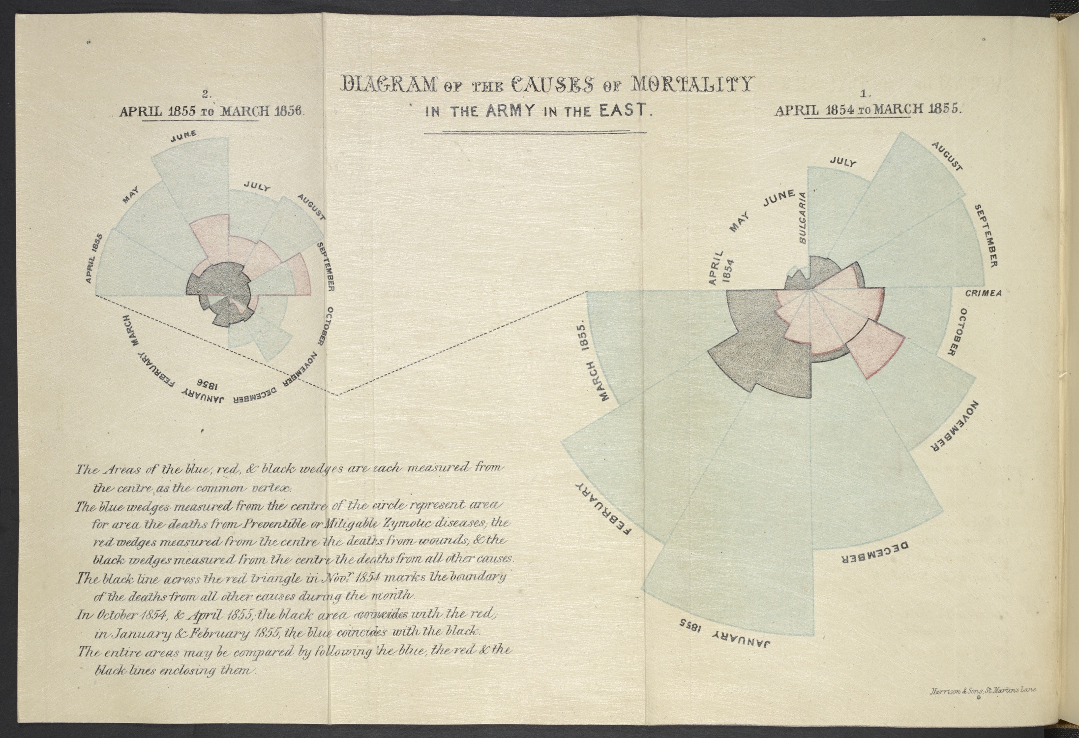
In her seminal ‘rose diagram’, Florence Nightingale demonstrated that far more soldiers died from preventable epidemic diseases (blue) than from wounds inflicted on the battlefield (red) or other causes (black) during the Crimean War (1853-56). Courtesy British Library
Next, there’s a contemporary reworking of Florence Nightingale’s Rose,
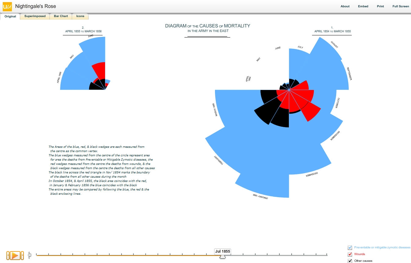
Cambridge University statistician David Spiegelhalter and his colleagues have taken the data from Florence Nightingale’s ‘rose diagram’ and animated the ‘rose’, as well as picturing the data as a bar chart and icon diagram. This shows not only the lasting relevance of Nightingale’s diagram as a visual icon, but also demonstrates how data can be pictured in different ways, to different effect. Courtesy British Library
This next image from the Beautiful Science show leads to Vancouver,
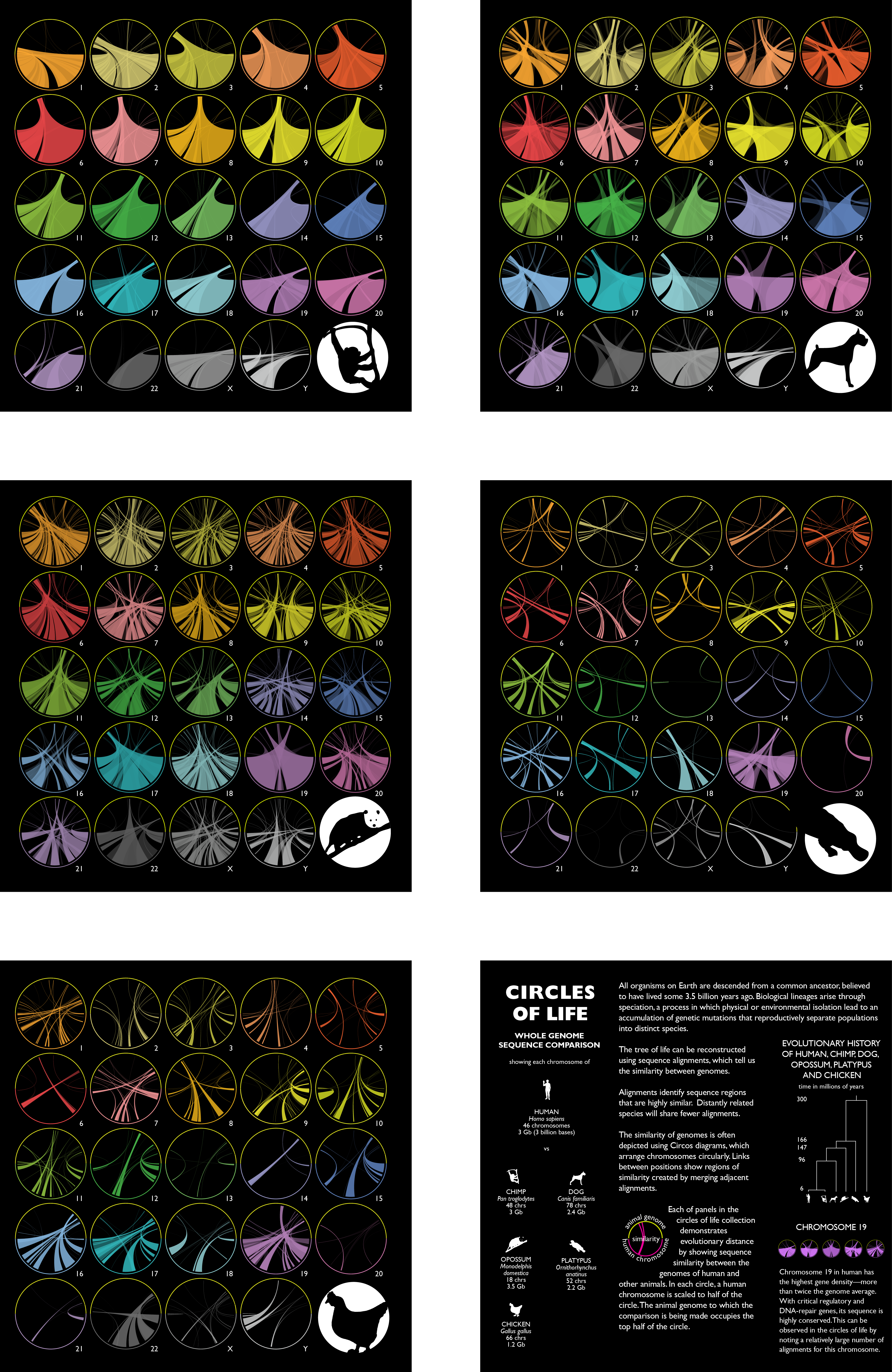
Specially commissioned for Beautiful Science, these striking ‘Circos’ diagrams picture the genetic similarities between humans and five other animals: chimpanzee, dog, opossum, platypus and chicken. Courtesy British Library
This particular set of ‘Circos’ diagrams are also called the ‘Circles of Life’ and were created by Martin Krzywinski, a Vancouver-based scientist (mostly biosciences) and data visualizer. His blog features his data visualization work which is quite beautiful and, I imagine, is at least part of the reason for the worldwide interest in his work. Krzywinsk has contributed to a Nature (journal) group blog devoted to data visualization. The blog has since been retired but the July 30, 2013 posting provides a subject index to the group’s postings. Krzywinsk was also a featured speaker at a WIRED (magazine) Data | Life conference in New York City on Nov. 6, 2013.