Part 1 of this piece featured definitions for the word mashup and a commentary on the current (Jan. 23 – April 23, 2016 [ETA April 4, 2016: The show has been extended to Friday, May 20, 2016.]) Rennie Collection show which is a mashup in all but name. This part is going to focus on the Vancouver Art Gallery’s show ‘Mashup: The Birth of Modern Culture’ (Feb. 20 – June 12, 2016). There will also be mention of a couple of precursor mashup shows and there will be a few comments about artists, mashups, and curators.
Mashup: The Birth of Modern Culture
Immediately, you hear the sounds of the show bleeding into the Vancouver Art Gallery’s (VAG) lobby. With 371 works representing 156 artists, it is the largest and most ambitious show in the gallery’s 85-year (founded in 1931) history. (20% of the works are from the VAG’s collection and the other 80% are from elsewhere.)
The first mashup experience is a wall of screens (reminding me of a movie ‘The Man Who Fell to Earth’ starring David Bowie as an alien who like to watch multiple television sets arranged as a wall of screens) where pieces in the show flash on in a mesmerizing fashion. If you stay long enough in front of the bank of screens, you will see the entire show cycle through. It’s an appropriate beginning for a show that overwhelms the senses and in many ways reflects modern culture.
Each floor hosts a different ‘age’ with the first floor representing ‘The Digital Age: Hacking, Remix and the Archive in the Age of Post-Production’, the second floor the ‘Late Twentieth Century: Splicing, Sampling and the Street in the Age of Appropriation’, the third floor the ‘Post-War: Cut, Copy and Quotation in the Age of Mass Media, and the fourth floor the ‘Early Twentieth Century: Collage, Montage and Readymade at the Birth of Modern Culture. Somewhat counterintuitively you go backward in time.
The press tour I attended was trotted through the not quite ready for prime time show pretty briskly two days before the opening so your experience may vary from what I am about to describe. In fact, it’s a certainty it will, given the wealth of works shown.
By contrast with the Rennie Collection show which focused on social issues, this show is focused, although some of the artists do address social issues, on the art history of the last hundred years or so.
In a sense, Marcel Duchamp provides the through-line for the show. Sherrie Levine’s ‘urinal’ (cast in bronze with a gold patina) evokes the ‘original’ version in a fashion I read as teasing,
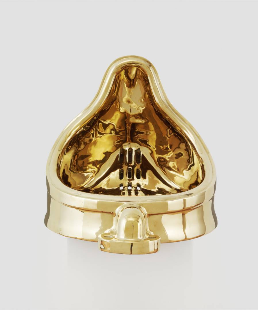
Sherrie Levine’s Fountain (After Marcel Duchamp), 1991, cast bronze and artist’s wooden base,Glenstone Photo: Tim Nightswander/Imaging4Art.com
Here’s an image of the original,
![The original Fountain by Marcel Duchamp photographed by Alfred Stieglitz at the 291 (Art Gallery) after the 1917 Society of Independent Artists exhibit. Stieglitz used a backdrop of The Warriors by Marsden Hartley to photograph the urinal. The entry tag is clearly visible. [downloaded from https://en.wikipedia.org/wiki/Fountain_%28Duchamp%29]](http://www.frogheart.ca/wp-content/uploads/2016/03/MarcelDuchampsUrinal.jpg)
The original Fountain by Marcel Duchamp photographed by Alfred Stieglitz at the 291 (Art Gallery) after the 1917 Society of Independent Artists exhibit. Stieglitz used a backdrop of The Warriors by Marsden Hartley to photograph the urinal. The entry tag is clearly visible. [downloaded from https://en.wikipedia.org/wiki/Fountain_%28Duchamp%29]
Here’s a description of the ‘fountain’ and its place in contemporary art history, from the
Fountain (Duchamp) entry in Wikipedia (Note: Links have been removed),
Fountain is a 1917 work produced by Marcel Duchamp. The piece was a porcelain urinal, which was signed “R.Mutt” and titled Fountain. Submitted for the exhibition of the Society of Independent Artists, in 1917, the first annual exhibition by the Society to be staged at The Grand Central Palace in New York, Fountain was rejected by the committee, even though the rules stated that all works would be accepted from artists who paid the fee. Fountain was displayed and photographed at Alfred Stieglitz’s studio, and the photo published in The Blind Man, but the original has been lost. The work is regarded by art historians and theorists of the avant-garde, such as Peter Bürger, as a major landmark in 20th-century art. 17 replicas commissioned by Duchamp in the 1960s now exist.[2]
Mashup has a Marcel Duchamp ‘fountain’ on the VAG’s fourth floor. Levine’s piece can be found on the second floor. So, this Duchamp ‘throughline’ takes us almost from the present into the past.
One installation that seemed interesting but wasn’t ready at the preview was a music room (on the second floor) featuring David Byrne’s and Brian Eno’s album, ‘My Life in the Bush of Ghosts’. The album’s Wikipedia entry has this (Note: Links have been removed),
Recorded by Eno and Byrne in between their work on Talking Heads projects, the album combines sampled vocals, African rhythms, found sounds, and electronic music,[6] and has been called a “pioneering work for countless styles connected to electronics, ambience, and Third World music”.[2] The extensive use of sampling on the album is widely considered ground-breaking and innovative, though its actual influence on the sample-based music genres that later emerged continues to be debated.[7][8]
Also on the second floor is a roomlet of bookcases (floor to ceiling) featuring copies of a 1376-page book titled ‘S, M, L, XL’. by Rem Koolhaus (internationally renowned Dutch architect) and Bruce Mau, a Canadian graphic designer. It made a bit of a splash when it was published in 1995 but its Wikipedia entry is somewhat muted. Perhaps its prominence in Mashup is in part due to Mau’s Massive Change show which was premiered at the Vancouver Art Gallery in October 2004.
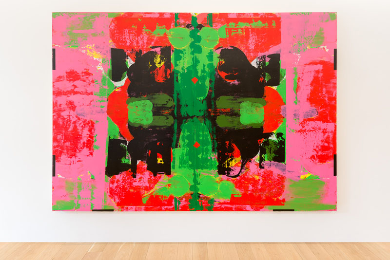
One of my favourite pieces (due to its bright colours and movement) was by Robert Rauschenberg, [Revolver II] on the third floor,
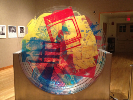
Rauschenberg – Revolver II – Silk screen on plexiglass – 1967 Courtesy: fibonaccisusan
This piece has an interesting history as described in a Jan. 25, 2014 (?) post by Susan Happersett on her fibonaccisusan website concerning Math Art,
E.A.T Experiments in Art and Technology 1960 – 2014 is the current exhibition on display at the Payne Gallery at Moravian College in Bethlehem, Pennsylvania. This small show documents the collaborations of artists with scientists and engineers from Bell Labs in NJ. Two Bell Labs engineers, Billy Kluver and Fred Waldhauer, started working with artists, providing them access to the newest technology. In 1966 they helped bring together 30 scientists and engineers with 11 artists to produce a cutting edge performance art series called 9 Evenings: Theater and Engineering in NYC. Through these partnerships, the engineers were trying to do two things. They wanted to address the effects of technology on society, and they were looking for new ways to explore this technology. Not all of the work was performance art, it also included sculpture, drawing and architecture.
What does this have to with Math Art? If you look at the time line for these collaborations you see that in 1966 computers were the new technology. Some of the art work done in these experiments was based on Mathematical algorithms.
Robert Rauschenberg
Robert Rauschenberg was one of the artists closely involved with E.A.T. One of his projects was a series of six “Revolvers”. “Revolver II” from 1967 is on display in the center of the gallery. It consists of 5 plexiglass circles that have been printed with silk screen. They rotate independently when one of five buttons is pushed. Because the circles are transparent, the different rotations (1, 2, 3, 4, or 5 circles at a time) create interesting geometric patterns.
‘Revolver II’ has a control box so you can push a switch and make things happen.
While it’s not stated explicitly, technology is an important motif in this show as the technologies of different periods make some of these art pieces and installations possible.
While the infamous (in some circles) Duchamp ‘Fountain’ can be found on the fourth floor, it was another of Duchamp’s pieces there which caught my attention. ‘La boîte-en-valise’ largely because it reminded me of a dollhouse. New York’s Museum of Modern Art (MOMA) devotes a webpage to the ‘boîte’,
Duchamp’s Boîte-en-valise, or box in a suitcase, is a portable miniature monograph including sixty-nine reproductions of the artist’s own work. Between 1935 and 1940, he created a deluxe edition of twenty boxes, each in a brown leather carrying case but with slight variations in design and content. A later edition consisting of six different series was created during the 1950s and 1960s; these eliminated the suitcase, used different colored fabrics for the cover, and altered the number of items inside. Each box unfolds to reveal pull-out standing frames displaying Nude Descending a Staircase and other works, diminutive Readymades hung in a vertical “gallery,” and loose prints mounted on paper. Duchamp included in each deluxe box one “original.” In The Museum of Modern Art’s Boîte-en-valise, this is a hand-colored print depicting the upper half of The Bride Stripped Bare by her Bachelors, Even, or Large Glass (1915-23). Among the reproductions found in the box is L.H.O.O.Q., a rectified Readymade created by taking a cheap print of the Mona Lisa and adding a moustache, goatee, and lascivious pun (understood when the letters L-H-O-O-Q are pronounced rapidly in French to mean “she’s got a hot ass”). Duchamp’s boxes, along with his altered Mona Lisa, address museums’ ever-increasing traffic in reproductions and question the relative importance of the “original” work of art.
Here’s an image of one of the many ‘boxes’ appearing in an April 20, 2012 article by Brady Carlson for New Hampshire Public Radio,
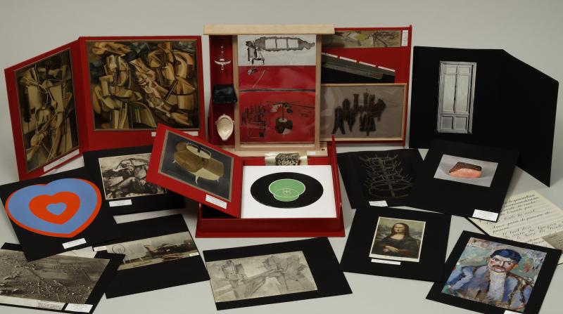
Marcel Duchamp, Box in a Valise (Boîte-en-valise, Series F), 1966, mixed-media assemblage.
Courtesy Hood Museum of Art
The ‘boîte’ in the VAG’s Mashup came from the Art Gallery of Ontario and according to the show’s lead curator, Bruce Grenville, this is the last time, due to fragility, the piece will be loaned out.
Commentary
Both the Rennie Collection’s ‘untitled’ mashup and the VAG’s ‘Birth of Modern Culture’ mashup are overwhelming experiences. The issues raised in Rennie’s curatorial outing (it took him five years and it’s his first attempt) are difficult, complex, and, at times, quite confronting. And while art history might seem like a more sedate topic, the VAG’s mashup (10 years from when Grenville first had the idea including three years to execute the plan) reflects the frenetic, frantic pace and noise (both literally and informationwise) of contemporary life. Both shows do beg repeat viewings.
These shows also pose a question about the role of artists and the role of curators. If a mashup, as I noted in part one, “… is when you bring together multiple source materials to create something new” and curators are bringing these pieces together to create something new, then is the curator also the artist?
Rennie could argue that he has brought pieces together in a way which reflects each artist’s concerns and demonstrates how different artists approach the same social issues. So, he’s less an artist and more a curator who has found a way to highlight each artist while reflecting contemporary concerns.
By contrast, the curators at the VAG (Bruce Grenville, Daina Augaitis, and Stephanie Rebick took a creator’s approach to their show and in some ways could be viewed as subverting the artists.
Rennie and the VAG curators have facilitated their own subversion as viewers mentally construct their own show from the works on display. While, it could be said that viewers always construct their own shows, the sheer number of pieces in the VAG’s Mashup and Rennie’s ‘untitled chaos’ demand it.
Previous Vancouver art gallery/museum mashups
Surrey Art Gallery (Surrey is in the Vancouver metropolitan area) had a mashup in 2007, Cultural Mashups, Bhangra, Bollywood + Beyond (PDF). Plus the University of British Columbia’s Museum of Anthropology had a mashup show sometime in the mid-1980s that was a revelation to me. Objects were brought together in completely unexpected ways to showcase similarities of disparate cultures across time. Sadly, I don’t recall the title of the show.
Going to the Rennie Collection and VAG shows
As noted in part one, you have to book a tour for the Rennie Collection but the show is free. Scheduled tours are given on Saturdays, Sundays, and Thursdays.
The VAG show costs $24 for adults and $55 for families. Seniors and students do get a break, it’s $18 for them. In addition seniors (65+) can pay by donation from 10 am to 1 pm on Mondays: March 7, 2016, April 4, 2016, May 2, 2016, and June 6, 2016. There are no show passes but you can purchase a membership which if you go often enough to the VAG can be a good deal. Tuesday nights used to feature a donation entry fee after 5 pm but that seems to have been eliminated.
Reviews and commentaries from elsewhere
Robin Laurence who writes about visual art for the Georgia Straight newspaper and many other publications has two pieces, a Feb. 10, 2016 preview of the show (MashUp charts modern culture’s mad mixing; The Vancouver Art Gallery’s monumental new show links everyone from Picasso to Basquiat and Tarantino) and a Feb. 23, 2015 review (MashUp reveals the pivotal role of women in pioneering of modern art methods). I particularly appreciated this bit in her review,
Despite the large number of women among the show’s 28 collaborating curators, female artists are dramatically underrepresented in MashUp. By my count, they number 36 out of the 156 listed in the show’s media kit. Nonetheless, an interesting subtheme emerges here: the important, if not always acknowledged, role women played in pioneering collage and photomontage techniques.
…
On the VAG’s fourth floor, where the early-modernist works are installed, a couple of didactic panels alert us to the photo-collages that were produced by aristocratic English women during the Victorian era. “Decades before the collage experiments of…the 20th century European avant-garde,” the text tells us, “the manipulation of photographs had already become a popular technique.”
The greatly enlarged example of a genteel-pastime precursor to photomontage is a late-1870s work by Kate Edith Gough. Her homely watercolour scene of a pond is given a surreal twist by cut-out photos of women’s heads mounted onto the necks of painted ducks. The effect is unsettling–a precursor to surrealism.
…
The show doesn’t allude at all to Mary Delany, the 18th-century “gentlewoman” credited with inventing mixed-media collage, an art form she described as “paper-mosaicks”. An accomplished amateur artist, Delany created, in her 70s and 80s, an extraordinary series of botanical drawings using cut paper and watercolour mounted on a black ground. (Not only are they extremely beautiful and dazzlingly detailed, they are also scientifically accurate.) But perhaps she was too botanically inclined and too far in advance of the modern era to be considered here—more’s the pity.
Point taken Ms. Laurence and just in time for International Women’s Day, March 8, 2016.
Kevin Griffin of the Vancouver Sun chimes in with a Feb. 23, 2016 review on his blog where he provides more information about the Sherrie Levine piece mentioned earlier in this part,
An example of how the idea of the readymade has changed over time is Fountain (after Marcel Duchamp) by Sherrie Levine. Unlike Duchamp’s urinal, Levine’s wasn’t bought in a store but is a copy cast in bronze, a traditional sculptural material. By 1991 when she made the work, Levine appropriated Duchamp’s original but made it out a material that suggests that what was once a radical art gesture has now become tamed by art history.
While the VAG show received extensive coverage internationally prior to its opening, as of this day, March 8, 2016, I haven’t found many reviews other than a few local ones and one in the national newspaper, the Globe and Mail, by Marsha Lederman in a March 4, 2016 article,
During a period of intense experimentation between 1912 and 1914, Picasso and Georges Braque began to incorporate non-traditional materials in their compositions – wallpaper, newspapers, musical scores and other found materials – essentially inventing collage. This launches an entirely new mode of representation, something that will take on many forms and terms – assemblage, collage, détournement, appropriation, sampling, ripping and hacking (to name a few).
The impact of this radical move was tremendous and the VAG show demonstrates that it has reached far beyond visual art. You see it in architecture and design, in film; you hear it in music – an interconnectedness that links artists, eras, genres and mediums.
“Everything you see around you is really based in a kind of mashup, remix, sampling kind of sensibility,” says Grenville, who conceived the exhibition.
“We do like to encompass the historical but to see it from the contemporary perspective. And so trying to make sense out of mashup culture, we had to go back in time to see it and to understand: Where does this originate? How is it connected?”
The exhibition is organized chronologically in four sections, each with its own floor. On the first floor, the contemporary – the digital age. Here you can lie back on blue pillows in German filmmaker Hito Steyerl’s video installation Liquidity Inc. (2014) and let the story of economic loss, mixed martial arts – and water – wash over you; blue judo mats act as sound buffers, also part of the installation.
You can watch an armed Ronald McDonald take Big Boy hostage in French graphics and animation studio H5’s animated short Logorama (2009) – which uses more than 2,500 logos.
…
While there are a few others, the last review I’m including here is Helen Wong’s March 2, 2016 article for Sad Mag (Note: I found her article on March 7, 2016 after I finished my set of impressions and found she and I shared more than one; we have not communicated with each other),
In the exhibition preview Grenville stated their goal was to ensure their visitors would return again and again. By creating such a massive and comprehensive show, there is no choice but to return. Frankly, going and seeing the exhibition in one go is overwhelming and exhausting. [emphasis mine] There is so much work to see that by the time you finish, your thoughts resemble the mashup of the exhibition. In a way, the design of the exhibition presents a mashup in itself where hundreds of works are presented to the viewer, giving you the responsibility of picking out what’s important. I found that this also mirrors modern day society as information and images are given to us at a speed quicker than ever. We are prone to distraction as our attention spans decline.
What follows is a segue of sorts into the New York art scene which disconcertingly brings to mind the current situation with the VAG’s interest in moving to a purpose-built space and its current show.
Contemporary art museum scene
For anyone who’s interested in the Vancouver art scene, it’s hard to miss the Vancouver Art Gallery’s current drive to raise $350M for a new space. This desire for a newer, bigger box is not confined to Vancouver as Jerry Saltz points out in his April 19, 2015 piece for the Vulture where he explores the drive for bigger and better in New York City’s art scene (Note: Links have been removed),
… museums have changed — a lot. Slowly over the past quarter-century, then quickly in the past decade. These changes have been complicated, piecemeal, and sometimes contradictory, with different museums embracing them in different ways. But the transformation is visible everywhere. Put simply, it is this: The museum used to be a storehouse for the art of the past, the display of supposed masterpieces, the insightful exploration of the present in the context of the long or compressed histories that preceded it. Now — especially as embodied by the Tate Modern [Note: The Swiss architects responsibe for the Tate Modern have been retained for the proposed new VAG space], Guggenheim Bilbao, and our beloved MoMA — the museum is a revved-up showcase of the new, the now, the next, an always-activated market of events and experiences, many of which lack any reason to exist other than to occupy the museum industry — an industry that critic Matthew Collings has called “bloated and foolish, corporatist, ghastly and death-ridden.”
The list of fun-house attractions is long. At MoMA, we’ve had overhyped, badly done shows of Björk and Tim Burton, the Rain Room selfie trap, and the daylong spectacle of Tilda Swinton sleeping in a glass case. This summer in London you can ride Carsten Höller’s building-high slides at the Hayward Gallery — there, the fun house is literal. Elsewhere, it is a little more “adult”: In 2011, L.A.’s MoCA staged Marina Abramovic’s Survival MoCA Dinner, a piece of megakitsch that included naked women with skeletons atop them on dinner tables where attendees ate. In 2012, the Los Angeles County Museum of Art paid $70,000 for a 21-foot-tall, 340-ton boulder by artist Michael Heizer and installed it over a cement trench in front of the museum, paying $10 million for what is essentially a photo op. Last year, the Museum of Contemporary Art in Chicago mounted a tepid David Bowie show, which nevertheless broke records for attendance and sales of catalogues, “limited-edition prints,” and T-shirts. Among the many unfocused recent spectacles at the Guggenheim were Cai Guo-Qiang’s nine cars suspended in the rotunda with lights shooting out of them. The irony of these massively expensive endeavors is that the works and shows are supposedly “radical” and “interdisciplinary,” but the experiences they generate are closer, really, to a visit to Graceland — “Shut up, take a selfie, keep moving.”
In this way, an old museum model has been replaced by another one. Museums that were roughly bookish, slow, a bit hoity-toity, not risk-averse but careful, oddly other, and devoted to reflection, connoisseurship, cultivation, and preservation (mostly of the past but also of new great works) — these museums have transformed into institutions that feel faster, indifferent to existing collections, and at all times intensely in pursuit of new work, new crowds, and new money. We used to look at these places as something like embodiments and explorations of the canon — or canons, since some (MoMA’s and Guggenheim’s modernism collections) were narrower and more specialized than others (the Met’s, the Louvre’s). But whatever long-view curating and collecting museums do now — and many of them still do it well — the institutions that are sucking up the most energy are the ones that have made themselves into platforms for spectacle, as though the party-driven global-art-fair feeding frenzy had taken up residence in one place, and one building, permanently. Plus, accessibility has become everything. More museums are making collections available online — sad to say, art is sometimes better viewed there than in the flesh, thanks to so much bad museum architecture and so little actual space to display permanent collections. Acoustiguides have become more and more common, and while there’s much good they can do, it often seems their most important function is crowd control — moving visitors through quickly to make room for the next million.
The museums of New York can already feel alien with this new model taking over. And we’re really at the beginning rather than the end of the transformation. All four of Manhattan’s big museums — the Met, MoMA, the Whitney, and the Guggenheim — have undertaken or are involved in massive expansion, renovation, and rebuilding. …
It’s a fascinating read for its perspective on the New York art and international art scenes. Well worth reading.
Final words
After reading Saltz’s piece and recalling the VAG’s expansionist plans, I am beginning to wonder if their Mashup spectacle is a precursor for their future contributions to Vancouver’s art scene. Is quiet contemplation going to disappear from our public galleries and museums?
Part 1 which includes definitions for mashups and a review of the Jan. 23 – April 23, 2016 [ETA April 4, 2016: The show has been extended to Friday, May 20, 2016.] is here.


![[downloaded from http://www.artnews.com/top200/bob-rennie/]](http://www.frogheart.ca/wp-content/uploads/2016/03/BobRennie.jpg)
![Robert Buck, The Shrine (from e to u), 2000/2012 Flowers, candles, stuffed animals, balloons, thrift store artifacts, etc. [Downloaded from http://www.renniecollection.org/exhibitions/beckbuck/index.php]](http://www.frogheart.ca/wp-content/uploads/2013/04/Rennie_BeckBuck_Web08.jpg)

