Tag Archives: typography

Speed up your reading with an interactive typeface

A May 12, 2021 news item on ScienceDaily brings news of a technology that makes reading easier,

AdaptiFont has recently been presented at CHI, the leading Conference on Human Factors in Computing.

Language is without doubt the most pervasive medium for exchanging knowledge between humans. However, spoken language or abstract text need to be made visible in order to be read, be it in print or on screen.

How does the way a text looks affect its readability, that is, how it is being read, processed, and understood? A team at TU Darmstadt’s Centre for Cognitive Science investigated this question at the intersection of perceptual science, cognitive science, and linguistics. Electronic text is even more complex. Texts are read on different devices under different external conditions. And although any digital text is formatted initially, users might resize it on screen, change brightness and contrast of the display, or even select a different font when reading text on the web.

A May 12, 2021 Technische Universitat Darmstadt (Technical University of Damstadt; Germany) press release (also on EurekAlert) provides more detail,

The team of researchers from TU Darmstadt now developed a system that leaves font design to the user’s visual system. First, they needed to come up with a way of synthesizing new fonts. This was achieved by using a machine learning algorithm, which learned the structure of fonts analysing 25 popular and classic typefaces. The system is capable of creating an infinite number of new fonts that are any intermediate form of others – for example, visually halfway between Helvetica and Times New Roman.

Since some fonts may make it more difficult to read the text, they may slow the reader down. Other fonts may help the user read more fluently. Measuring reading speed, a second algorithm can now generate more typefaces that increase the reading speed.

In a laboratory experiment, in which users read texts over one hour, the research team showed that their algorithm indeed generates new fonts that increase individual user’s reading speed. Interestingly all readers had their own personalized font that made reading especially easy for them. However: This individual favorite typeface does not necessarily fit in all situations. “AdaptiFont therefore can be understood as a system which creates fonts for an individual dynamically and continuously while reading, which maximizes the reading speed at the time of use. This may depend on the content of the text, whether you are tired, or perhaps are using different display devices,” explains Professor Constantin A. Rothkopf, Centre for Cognitive Science und head of the institute of Psychology of Information Processing at TU Darmstadt.

The AdaptiFont system was recently presented to the scientific community at the Conference on Human Factors in Computing Systems (CHI). A patent application has been filed. Future possible applications are with all electronic devices on which text is read.

There’s a 5 minute video featuring the work and narration for a researcher who speaks very quickly,

Here’s a link to and a citation for the paper,

AdaptiFont: Increasing Individuals’ Reading Sp0eed with a Generative Font Model and Bayesian Optimization by Florian Kadner, Yannik Keller, Constantin Rothkopf. CHI ’21: Proceedings of the 2021 CHI Conference on Human Factors in Computing Systems May 2021 Article No.: 585 Pages 1-11 DOI: https://doi.org/10.1145/3411764.3445140 Published: 06 May 2021

This paper is open access.

Artificial intelligence is not mentioned but it’s hard to believe that adaptive learning by the software is anything other than a form of AI.
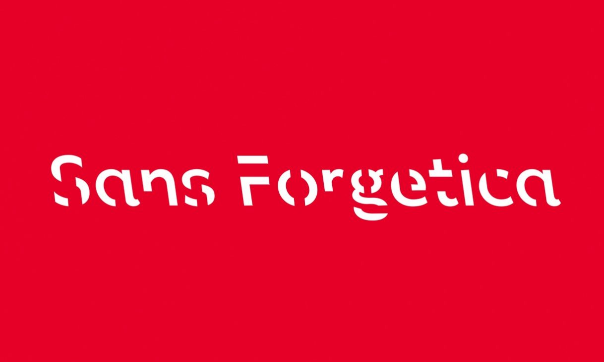
Students! Need help with your memory? Try Sans Forgetica

Sans forgetica is a new, scientifically and aesthetically designed font to help students remember what they read.

An October 4, 2018 news article by Mark Wycislik-Wilson for Beta News announces the new font,

Researchers from Australia’s RMIT University have created a font which they say could help you to retain more data.

Sans Forgetica is the result of work involving typographic design specialists and psychologists, and it has been designed specifically to make it easier to remember written information. The font has purposefully been made slightly difficult to read, using a reverse slant and gaps in letters to exploit the “desirable difficulty” as a memory aid.

An October 3, 2018 RMIT University press release, which originated the news item, provides more details,

Sans Forgetica could help people remember more of what they read.

Researchers and academics from different disciplines came together to develop, design and test the font called Sans Forgetica.

The font is the world’s first typeface specifically designed to help people retain more information and remember more of typed study notes and it’s available for free.

It was developed in a collaboration between typographic design specialist and psychologists, combining psychological theory and design principles to improve retention of written information.

Stephen Banham, RMIT lecturer in typography and industry leader, said it was great working on a project that combined research from typography and psychology and the experts from RMIT’s Behavioural Business Lab.

“This cross pollination of thinking has led to the creation of a new font that is fundamentally different from all other font. It is also a clear application of theory into practice, something we strive for at RMIT,” he said.

Chair of the RMIT Behavioural Business Lab and behavioural economist, Dr Jo Peryman, said it was a terrific tool for students studying for exams.

“We believe this is the first time that specific principles of design theory have been combined with specific principles of psychology theory in order to create a font.”

Stephen Banham, RMIT lecturer in typography and industry leader, was part of the Sans Forgetica team.

The font was developed using a learning principle called ‘desirable difficulty’, where an obstruction is added to the learning process that requires us to put in just enough effort, leading to better memory retention to promote deeper cognitive processing.

Senior Marketing Lecturer (Experimental Methods and Design Thinking) and founding member of the RMIT Behavioural Business Lab Dr Janneke Blijlevens said typical fonts were very familiar.

“Readers often glance over them and no memory trace is created,” Blijlevens said.

However, if a font is too different, the brain can’t process it and the information is not retained.

“Sans Forgetica lies at a sweet spot where just enough obstruction has been added to create that memory retention.”

Sans Forgetica has varying degrees of ‘distinctiveness’ built in that subvert many of the design principles normally associated with conventional typography.

These degrees of distinctiveness cause readers to dwell longer on each word, giving the brain more time to engage in deeper cognitive processing, to enhance information retention.

Roughly 400 Australian university students participated in a laboratory and an online experiment conducted by RMIT, where fonts with a range of obstructions were tested to determine which led to the best memory retention. Sans Forgetica broke just enough design principles without becoming too illegible and aided memory retention.

Dr Jo Peryman and Dr Janneke Blijlevens from the RMIT Behavioural Business Lab provided psychological theory and insights to help inform the development, design and testing of Sans Forgetica.

RMIT worked with strategy and creative agency Naked Communications to create the Sans Forgetica concept and font.

Sans Forgetica is available free to download as a font and Chrome browser extension at sansforgetica.rmit.

Thank you Australian typographic designers and psychologists!

Getting the logos they deserve: 50 physicists and mathematicians

There are some 50 logos created by Dr. Prateek Lala of the University of Toronto (Canada) on behalf of various physicists and mathematicians. Before showing any of these clever logos, here’s a bit more about Dr. Lala’s logos in John Brownlee’s Feb. 5, 2014 article for Fast Company (Note: Links have been removed),

The scientific typographics were created by Dr. Prateek Lala, a physician and amateur calligrapher from Toronto. Inspired by the type biographies of Indian graphic designer Kapil Bhagat, Lala designed his logos to make the lives and discoveries of various scientists more engaging and immediately relatable to students.

Kelly Oakes in a Feb. 3, 2014 post for BuzzFeed features 20 of the logos and I’ve downloaded two of them for here,

James Clerk Maxwell (1831-1879) formulated the equations that describe electricity, magnetism, and optics as manifestations of the same phenomenon – the electromagnetic field. He’s also the namesake of Maxwell’s demon, a thought experiment in which a hypothetical demon violates the Second Law of Thermodynamics. Credit: Dr. Prateek Lala / Perimeter Institute

James Clerk Maxwell (1831-1879) formulated the equations that describe electricity, magnetism, and optics as manifestations of the same phenomenon – the electromagnetic field. He’s also the namesake of Maxwell’s demon, a thought experiment in which a hypothetical demon violates the Second Law of Thermodynamics. Credit: Dr. Prateek Lala / Perimeter Institute

I particularly enjoy how Dr. Lala has introduced the ‘demon’ into the logo. And then, there’s this one,

Rosalind Franklin (1920-1958) was a biophysicist who used X-ray diffraction data to determine the structures of complex minerals and living tissues, including – famously – DNA. Credit: Dr. Prateek Lala / Perimeter Institute

Rosalind Franklin (1920-1958) was a biophysicist who used X-ray diffraction data to determine the structures of complex minerals and living tissues, including – famously – DNA. Credit: Dr. Prateek Lala / Perimeter Institute

There is a bit of a controversy regarding Franklin as many believe she should have received more acknowledgement for her role in Crick and Watson’s ‘discovery of DNA’. I last mentioned Franklin in an August 19, 2013 posting (scroll down half-way) featuring a rap, Rosalind Franklin vs Watson & Crick, which was written and performed by children as part  of Tom McFadden’s Battle Rap Histories of Epic Science (Brahe’s Battles) school science project. The rap does a very good job of summarizing the discovery and the controversy and the performance is of a professional grade.

Getting back to Dr. Lala’s logos, there’s a slide show of 50 logos on this Perimeter Institute for Theoretical Physics webpage. I selected this one from the slideshow for inclusion here,

Aryabhatta (476-550) was a pioneer of mathematics and astronomy in India. He is believed to have devised the concept of zero and worked on the approximation of pi. Credit Dr. Prateek Lala / Perimeter Institute

Aryabhatta (476-550) was a pioneer of mathematics and astronomy in India. He is believed to have devised the concept of zero and worked on the approximation of pi. Credit Dr. Prateek Lala / Perimeter Institute

Dr. Lala has created some infographics of his logos which are can be seen here at visual.ly or you can see one featuring 60 of his logos in a July 26, 2013 posting by Carolina Brandão Zanelli on her Art for Scientists blog. As well, the Perimeter Institute is offering a poster of Dr. Lala’s logos in the Fall 2013 issue of their Inside the Perimeter magazine available here.

I was a little curious about Dr. Lala and was able to find this on academia.edu,

Prateek Lala
University of Toronto, Medicine, Post-Doc

Research Interests:
Medicine, Pharmacology, Drug metabolism, Pharmacoinformatics and Education

Enjoy!