Tag Archives: Bob Rennie

Ian Wallace show: the frame/box within the frame/box within the frame/box (at the Rennie Gallery in Vancouver, Canada until Sept. 30, 2017)

The opening reception for the Ian Wallace exhibition (Ian Wallace: Collected Works, May 27 to Sept. 30, 2017) at the Rennie Collection was a celebration of both Ian Wallace and Bob Rennie’s donation of 197 art works to the National Gallery of Canada in Ottawa marking Canada’s 150th anniversary. Here’s more about the gift from a May 9, 2017 Rennie Collection notice (received via email),

In celebration of Canada’s 150th birthday, we are donating 197 paintings, sculptures and mixed-media pieces made by some of the most well-known and established Canadian and international artists working today to the National Gallery of Canada!

This is the largest gift of contemporary art ever received by the National Gallery, with major pieces created by internationally renowned artists, such as Colombian Doris Salcedo, as well as important Vancouver based artists Brian Jungen, Damian Moppett, Rodney Graham, Ian Wallace [emphasis mine], and Geoffrey Farmer, who is Canada’s selection for the 57th International Art Exhibition, La Biennale di Venezia.

Getting back to the Ian Wallace exhibition,

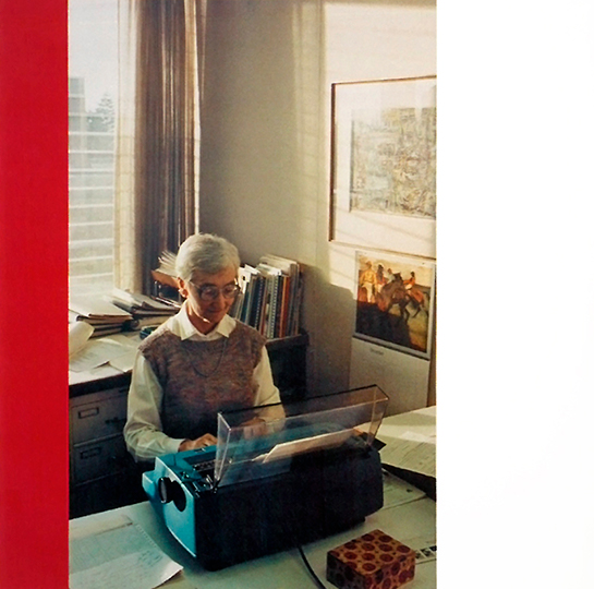
“The Idea of the University” (1990)  Courtesy: Rennie Collection

The commentary that follows are my impressions of the show, your mileage may vary.

What I found most intriguing was the ‘squareness’ of it all with its prevalence of frames/boxes. For example the image above is framed with red and white (paint on plywood) at the sides and within the image, there’s the window, the calendar, the photograph, a markedly squarish electric typewriter, a box on the desk, the cabinet behind the typist, and the books on the cabinet. One image could be a coincidence but when you’re surrounded by room after room  with these framed/boxed images of more frames and boxes, well, happenstance has to be rejected.

Wallace is a photographer-artist, one of the individuals in Vancouver, Canada, who founded  photoconceptualism (I sometimes mistakenly refer to this as photorealism). As you may have guessed from my parenthesized comment, I’m not a big fan of this movement or school. However, I’ve found that enjoyment or fandom isn’t necessarily the point where contemporary art is concerned. My experience is that contemporary art is largely intellectual rather than sensual. Sculptures, paintings, textiles, etc. are more sensual by nature where many contemporary pieces begin their existence in a machinist’s shop or via a piece of equipment such as a camera or as an algorithm.

To attend an exhibition of contemporary art, explanation is needed and thankfully the Rennie provides a tour guide providing insight into the artist and their work. In Wallace’s case (kudos, by the way, to Sydney who led the tour I attended), he’s a professor of art history whose main means of expression is photography and much of his focus is on the production of art.

For me though, it was all about square edges, frames, and boxes—an obvious association given that you frame your subject (inadvertently or not) when taking a photograph. There are images and pieces that don’t fit into my ‘square’ obsession but the number in this exhibition that did is amazing and dizzying. I got to the point where I was giddy enough to think of each room as yet another box/frame and we were the subjects leading to these questions: who is seeing, who is being seen, and what is being seen?

The fourth question: how we were seeing the images came up in the context of the show, more specifically, when viewing Wallace’s ‘Poverty 1980 – 1984’ series. It’s considered one of Wallace’s earlier works and like many of his pieces is a series of images. According to Sydney, Wallace is critiquing how we view poverty. In his view, poverty and images of poverty are often glamourized and to draw attention to that he had friends dress up as bohemians from an earlier period and pose in some of Vancouver’s dicier streets and alleyways. It’s not easy to see the images as they are indistinct and washed over in one colour or another.

Before commenting on this piece, I’ve got an excerpt from the Rennie Collection’s undated [?} press release,

Rennie Museum is pleased to announce a solo exhibition featuring rarely and never–before seen historic works of renowned Vancouver artist Ian Wallace. Highlighting Wallace’s perennial exploration of social issues, the works presented will also examine the crux of his artistic process: the intersectionality between public and private, personal and universal, process and production, abstraction and representation. The exhibition runs May 27 to September 30, 2017.

Included in the exhibition will be Poverty 1980 – 1984, a multimedia installation comprising of film, painting, and photography. Initially enacted in 1980 as a 16mm film commenting on the tradition of documentary film–making, the Poverty project offers variations on a single theme. By employing friends and colleagues to act out scenes of bohemian scarcity in Vancouver, Wallace creates fictionalized simulacra—an aestheticized model of poverty derived from our collective, often over–embellished, social conscious. [emphasis mine] The film stills are then abstracted through repetition and presented amidst monochromatic colour fields, prompting viewers to review their own cognitive processes.

I think I understand what is being described in the news release and I agree that poverty can be ‘aestheticized’ or made glamourous. In fact, there’s a term for it ‘poverty porn’. I first heard the term in relation to a series of images taken by Lincoln Clarkes and his series, Heroines (from his Wikipedia entry; Note: Links have been removed),

Heroines (Anvil Press) [3] is an epic photographic documentary of 400 addicted women of Vancouver’s Downtown Eastside, which won the 2003 Vancouver Book Award (in a tie with Stan Douglas), and was the subject of numerous philosophical essays (by Leigh Butler, Margot Leigh Butler, and Paul Ugor, among them). The London Observer said Clarkes’ book offered “beauty in a beastly place.” Globe and Mail called it “intimate, compelling and undeniably unsettling,” while The Toronto Star called it “incredibly powerful.”

Clarkes, who’d been a high end fashion photographer, took photographs of female addicts (hence heroin/heroine) living in Vancouver’s Downtown Eastside, an area which by then was and still is a national and international disgrace. Within the Downtown Eastside community there was a great deal of controversy over Clarke’s work hence the whispers about ‘poverty porn’.

I gather Clarkes’ initial impulse was to treat the women with respect and kindness and to try framing ‘addicts’ in the same way as he would a high fashion model rather than as one of the ‘wretched of the earth’. Unfortunately as the work evolved, it appeared to become a career stepping stone for him and any other concerns seemed to drop out of view. In the end, I couldn’t escape the impression that these women had been used again as unintentional as it may have been.

Getting back to Wallace, I see his point but I don’t understand how his hard-to-see images of fake bohemians in streets and alleyways that are unrecognizable even to a local make his point about glamourizing poverty. Presumably, Wallace’s images were taken in the Downtown Eastside, which in the 1980s was not nearly in the straits it is today. The social safety net cuts that came in the mid to later 1980s and the diminishment of the federal transfer funds to the provinces weren’t yet the stuff of nightmares for social activists.

In retrospect, Wallace’s images seem weirdly prescient, a kind of ‘fiddling while Rome burns ‘view of the future which is now our present day but, for me, they don’t exactly deglamourize poverty or give us a view of an “… over–embellished, social conscious.” In fact, there’s something a bit odd about seeing this piece in a gallery that is housed in the same building as Rennie’s real estate marketing business in a rapidly gentrifying area just a block or two away from where those ‘poverty images’ were taken. Add in the fact that the tour was made up of a relatively middle class group of people staring at poverty when the reality is block away the whole thing becomes head-spinning as these questions whirl who is seeing, who is being seen, and what is being seen?

The last piece I’m going to mention is the multi-panel “The Idea of the University” (1990). The piece brought back memories as I once worked at the University of British Columbia where Wallace took his images. It was a walk down the lane of ‘old technology’ with microfiche readers, electric typewriters, card catalogues, etc. Sydney Marshall (tour guide Sydney) has written a July 25, 2017 essay about the piece on the Rennie Collection’s website,

Without contest, my favourite artwork by Ian Wallace is The Idea of the University (1990). Installed in Rennie Museum’s monumental four-storey high exhibition space, the sprawling canvasses are almost as immense as their depicted subject: the University of British Columbia. It’s likely that I appreciate it so much because like Wallace, I also studied at U.B.C., sitting in the same lecture hall that he used to teach in. This sentimentality seems to be shared; local visitors will often stop to point out former professors, or remember old buildings that have since been demolished. The piece is an exercise in collective memory. Functioning like a time capsule, it allows viewers to reflect on developments from the past to present. This is, however, just one aspect of a multi-faceted piece. By using the competing technical modes of painting and photography to depict university spaces, Wallace challenges the notion that painting is the only valid form of artistic production within academia. Historically, art production has operated within a technical hierarchy, with painting as the most revered medium due to the artistic labour it necessitates. The 20th century’s shifting social climate ultimately sees a redistribution of this hierarchical power. In response to the increasing corporatization of the university space, anti-institutional dissent permeated universities across the North American continent – U.B.C. included. For Ian Wallace and his contemporaries, this manifested as a desire to dispute traditional designations of painting as the most inherently valuable way to produce art. With his work, Wallace recontextualizes the medium, placing it in direct conversation with its subsidiaries: photography, writing, and thinking. In doing so, he subverts the idea that a technical hierarchy needs exist at all, equating multiple forms of production across a broad spectrum of intellectual and artistic interests.


Ian Wallace
The Idea of the University I-XVI, 1990


Conceived for a special exhibition at the U.B.C. Fine Arts Gallery in 1990, the work features sixteen photographs of university spaces and personnel in various states of candidness, each flanked with bars of white and multicoloured monochrome. In its entirety, the work looks cinematic – as if it were a filmstrip of image stills pulled from a promotional clip. This is not to say the images are typically beautiful because, by all accounts, they’re not. The depicted spaces are not inherently exciting. Some photographs are oddly cropped, others slightly out of focus; these formal details are irrelevant to the medium’s intended purpose: its subject. Photography, as a medium, offers to art that which painting cannot. The photograph is able to capture the totality of ‘the everyday’ as it exists in a moment, bringing banality into focus and calling the viewer to engage with it further. Visible beauty no longer designates whether a work is ‘art’ or ‘not art’; instead, it is the depth of concept that provides this justification. The valorization of these images as ‘art’ is additionally supported by their proximity to monochrome painting. The white monochrome acts as grounding, a symbolic representation of the white-walled gallery space typically designating a work of art. The multicoloured inclusions operate similarly. Different on each canvas, the monochrome bars provide an aesthetic and historical reference to modernism that further situates the opposing photographs within an established artistic context. By referencing this history, Wallace is able to push the limit of acceptable artistic production, using the predetermined power of modernism to elevate the comparatively new medium of photography.

It should be noted that a key component of The Idea of the University is missing from its visual representation: Wallace’s catalogue essay. The writing has become a near immovable companion to the work, as it explains precisely why the artist has chosen to explore the subject of the university. In it, Wallace identifies the contemporary university as an abstracted space, caught between its founding principles and modern-day realities. The university is supposed to be a universalizing space, providing equal opportunity to acquire ‘truth’ and knowledge to everyone that passes through its metaphorical gates. Wallace almost immediately invalidates this idea by identifying the discrepancy between this ideal image and its actuality*. Instead of a collective organization united in the unhindered production of knowledge, the contemporary university exists as an ideology-producing institution that services a number of specific political and socioeconomic interests*. For Wallace, the same designation could be given to the discourse of art – a supposedly universal field that relies almost entirely on individual notions of taste and arbitrary economic determinations. The Idea of the University works as an evaluation of both the university and the discourse of art, but Wallace very intentionally leaves the canvasses open-ended. Instead, he presents the failures (or at least, potential failures) of these systems in his writing, using its visual counterpart as a stimulus by which the viewer can judge the validity of his propositions for themselves.


Ian Wallace
The Idea of the University I-XVI, 1990


Just as Wallace succeeds in neutrally depicting the university space, so too does he succeed in avoiding a singular narrative of exactly how knowledge is produced. He chooses not to privilege one form of ‘work’ over another, but does show immense regard for practice in general. Some empty and others full, most of the photographed spaces feature a single figure engaging in various forms of intellectual labour: reading, searching the web, or completing administrative tasks. All of these engagements are qualified as ‘work’ that contributes to the ultimate output of the university. This is paralleled by Wallace’s own technical expansions of artistic labour. He challenges traditional perceptions of painting and photography by combining the two, then supplementing the combination with writing. In this sense, it is neither the visual nor the written work that takes precedence, but the idea that all of these productive forms are equally valid. In essence, Wallace’s presentation of simultaneous forms of labour democratizes realms of production within art, decentralizing painting as the foundation upon which art must be based. Not only does artwork not need to be painted, it doesn’t even have to be visual. To Ian Wallace, a radical thought is as legitimate an artistic gesture as a visible brushstroke.

* Wallace, Ian. “The Idea of the University.” UBC Fine Arts Gallery, 1990. Page 23. Print.

The production of art and the production of knowledge would seem to be the dominant themes of this Ian Wallace exhibition and, I suspect, his life.

Anyone interested in seeing the show for themselves, can go here to save a space on one of the tours (for this show they are on Wednesdays, Thursdays, and Saturdays). It is also possible to book separate tours for groups of eight or more here.

Two tales of mashup visual art shows in Vancouver (Canada): part 1 of 2

I’ve been to two new exhibitions in Vancouver (Canada) and while both could be described as mashups, only one uses the word in its title. Before getting to the shows, here’s a little bit about mashups for anyone who’s not familiar with word.

A mashup definition

Generally speaking a mashup is when you bring together multiple source materials to create something new. Here’s a list of different types of mashups, from the Mashup Wikipedia entry,

Mashup may refer to:

  • Mashup (music), the musical genre encompassing songs which consist entirely of parts of other songs
  • Mashup (video), a video that is edited from more than one source to appear as one
  • Mashup (book), a book which combines a pre-existing text, often a classic work of fiction, with a certain popular genre such as vampire or zombie narratives
  • Mashup (web application hybrid), a web application that combines data and/or functionality from more than one source
  • Mash-Up (Glee), a musical theater performance composed of integrated segments from other performances as popularized by the American television series Glee
  • Mash Up (TV series), a television show on Comedy Central starring T.J. Miller.
  • Lotus Mashups, a Business Mashups editor developed and distributed by IBM as part of the IBM Mashup Center system
  • Band Mashups, the former name of the video game Battle of the Bands

While the book mashup seems relatively new, there have been other older literary mashups such as cut-up technique (Note: Links have been removed),

The cut-up technique (or découpé in French) is an aleatory literary technique in which a text is cut up and rearranged to create a new text. The concept can be traced to at least the Dadaists of the 1920s, but was popularized in the late 1950s and early 1960s by writer William S. Burroughs, and has since been used in a wide variety of contexts.

Arguably although problematically, the exquisite corpse could be included as a literary mashup (Note: Links have been removed),

Exquisite corpse, also known as exquisite cadaver (from the original French term cadavre exquis) or rotating corpse, is a method by which a collection of words or images is collectively assembled. Each collaborator adds to a composition in sequence, either by following a rule (e.g. “The adjective noun adverb verb the adjective noun”, as in “The green duck sweetly sang the dreadful dirge”) or by being allowed to see only the end of what the previous person contributed.

The technique was invented by surrealists and is similar to an old parlour game called Consequences in which players write in turn on a sheet of paper, fold it to conceal part of the writing, and then pass it to the next player for a further contribution. Surrealism principal founder André Breton reported that it started in fun, but became playful and eventually enriching. Breton said the diversion started about 1925, but Pierre Reverdy wrote that it started much earlier, at least before 1918.

In any event, music mashups (also called remix amongst other things) seem to have predated any other mashups, from the Mashup (music) Wikipedia entry,

A mashup (also mesh, mash up, mash-up, blend, bootleg[1] and bastard pop/rock) is a song or composition created by blending two or more pre-recorded songs, usually by overlaying the vocal track of one song seamlessly over the instrumental track of another.[2] …

The practice of assembling new songs from purloined elements of other tracks stretches back to the beginnings of recorded music [emphasis mine]. If one extends the definition beyond the realm of pop, precursors can be found in musique concrète, as well as the classical practice of (re-)arranging traditional folk material and the jazz tradition of reinterpreting standards. In addition, many elements of mashup culture have antecedents in hip hop and the DIY ethic of punk as well as overlap with the free culture movement.

Recorded music seems to have started sometime in the 1870’s, from the History of Sound Recording Wikipedia entry,

The history of sound recording – which has progressed in waves, driven by the invention and commercial introduction of new technologies – can be roughly divided into four main periods:

  • the “Acoustic” era, 1877 to 1925
  • the “Electrical” era, 1925 to 1945 (including sound on film)
  • the “Magnetic” era, 1945 to 1975
  • the “Digital” Era, 1975 to the present day.

It seems the musicians got there first. That settled, it’s time for the visual art exhibition that’s a mashup in principle if not in name. (Although Robin Laurence in part 2 makes a compelling case for the 18th century visual artist, Mary Delany and her ‘paper-mosaiks’ (scroll down about 75% of the way; it’s in the subsection titled ‘Reviews and commentaries from elsewhere’).

Rennie Collection

While he’s made his money as a Vancouver real estate marketer, Bob Rennie is better known internationally as someone who is passionately committed to the visual arts. Crowned as one of the top 200 art collectors in the world by ArtNews, Rennie rated  both a profile in ArtNews and a mention in the ArtNet News April 30, 2015 article, Top 200 Art Collectors Worldwide for 2015, Part Two. According to his entry on Wikipedia, there’s also this (Note: Links have been removed),

Rennie chairs the North America Acquisitions Committee (NAAC) at Tate Museum in London,[5]is a member of the Tate International Council and sits on the Dean’s Advisory Board to the Faculty of Arts at the University of British Columbia (since 2006). In recognition of his dedication to the arts and the arts community, he received an honorary doctorate of letters from Emily Carr University of Art and Design in 2008, and was appointed to the university’s Board of Governors in 2009.

Rennie joined the Board of Trustees at The Art Institute of Chicago in 2015.[6]

The current exhibition at the Rennie Collection (where pieces from his extensive art collection are displayed) is untitled and unique. The show was curated by Rennie himself (from the Rennie Collection Jan. ??, 2016 news release),

Rennie Collection is proud to present a major group exhibition featuring 41 prominent and emerging artists. Bringing together a variety of practices and media, this survey aims to reveal the chaos of the world by addressing enduringly pertinent issues, from migratory displacement to an in-depth examination of identity and history. The exhibition runs from January 23 to April 23, 2016 [ETA April 4, 2016: The show has been extended to Friday, May 20, 2016.].

“This is our twelfth exhibition at the Rennie Museum, with works from the collection. Although we never burden our shows with a formal title, the working title for this install− which mines 41 artists from the collection − is ‘chaos’. Given the chaos of the world, I wanted to bring tough topics into conversations.

From the first work that ever entered the collection, Norman Rockwells On Top of The World (1933) – a utopian world that I thought actually existed outside my childhood home in Vancouver’s eastside – through to Bob Beck’s Thirteen Shooters (2001) showcasing the Columbine killers – the world stopped sixteen years ago hearing the news of a school massacre – my concern today, and a focus of the exhibition, is on elevating the topics in the show. We just don’t stop anymore upon hearing the news.

For anyone familiar with the Rennie Collection, it is in a heritage building in one of the oldest parts of Vancouver. The building houses both the ‘gallery’ and Rennie’s real estate marketing business. Visits (tours) to see an exhibition must be booked; there is no ‘dropping in’.

When I attended, over 15 of us were booked for a visit, we were introduced to the exhibit by Whitney (a student from the University of British Columbia art history programme). Usually you get an introduction to every single piece in the exhibit but with over 41 artists represented and, I believe, 53 pieces being shown that proved to be impossible. That said, there is one piece which is likely to be everyone’s starting part and that is the camel or more precisely, John Baldessari’s 2013 Camel (Albino) Contemplating Needle (Large) on the ground floor by picture window where passersby can look in from the street.

The piece looks like a giant lump of camel-shaped plastic, smooth and white. The artist has coloured in the eyes which from most angles seem to be gazing not at the needle before it but heavenward. It is as you’ve likely guessed a reference to the saying about rich men having as much chance of getting into heaven as a camel has of passing through the eye of a needle. Whitney informed us that the saying can, more or less, be associated with Judaism, Christianity, and Islam. (If you look on Wikipedia (Eye of a needle) entry, you’ll find it can also be associated with the Bahá’í faith.) By the way, the saying is written on the gallery wall in Arabic.

It seems telling that the first piece is about rich men and their difficulty getting to heaven in a show curated by a rich man (Rennie’s stated intention seen later in this post does not resemble my response to the piece). Then, further into the gallery’s first floor, there are pieces by Jota Castro titled ‘Motherfuckers never die’. One of the pieces features a list of art collectors, both individual and corporate (not including Rennie), with the title prominently featured as the headline. It suggests a highly self-critical view both personally and socially, which is borne out through the rest of the exhibition.

Upstairs, the second floor is an overwhelming experience given that its three galleries are loaded with the bulk of the items. One of the more engaging pieces for me was ‘Animal Farm ’92 (after George Orwell)’, 1992 by Tim Rollins and K.O.S.

Orwell’s book ‘Animal Farm’ has been ripped apart so the pages could be glued to a huge canvas or some other surface. Over top of the book’s pages, artists have rendered political figures of the period as animals. The usual suspects are present: the US president, China’s president, France’s president, Japan’s prime minister and, more excitingly, leaders who are largely unknown outside their own countries. It was fascinatingly comprehensive.

The Tate (UK art gallery) has an image which shows you what I’m trying to describe but in no way conveys the scale,

Animal Farm - G7 1989-92 Tim Rollins born 1955 Lent from a private collection 2000 http://www.tate.org.uk/art/work/L02312

Animal Farm – G7 1989-92 Tim Rollins born 1955 Lent from a private collection 2000 http://www.tate.org.uk/art/work/L02312

You could spend hours contemplating the geopolitical and social implications both then and now. As well, the piece has an interesting story of its own as can be seen on the Tim Rollins and K.O.S webpage on the Massachusetts Institute of Technology (MIT) Press website,

In August 1981, artist and activist Tim Rollins was recruited by the principal of Intermediate School 52 in the South Bronx to develop a curriculum that combined art-making with lessons in reading and writing for students classified as “at risk.” On the first day of school, Rollins told his students, “Today we are going to make art, but we are also going to make history.” This book unfolds that history, offering the first comprehensive catalog of work created collaboratively by Rollins and several generations of students, now known as the “Kids of Survival.”

Rollins and his students developed a way of working that combined art-making with reading literature and writing personal narratives: Rollins or a student would read aloud from classic literary texts by such authors as Shakespeare and Orwell while the rest of the class drew or wrote on the pages being read, connecting the stories to their own experiences. Often, Rollins and his students (who later named themselves “Kids of Survival” or K.O.S.) cut out book pages and laid them on a grid on canvas before undertaking their graphic interventions. This process developed into the group’s signature style, which they applied to literary texts, musical scores, and other printed matter. This book and the accompanying major museum retrospective document the history of the groundbreaking practice of Tim Rollins and K.O.S., with full color images of paintings, drawings, sculptures, and prints. These include a caricature of Jesse Helms with an animal body drawn on the pages of Animal Farm; graffiti-like images painted in acrylic on the pages of Frankenstein; a gleaming pattern of fantastical golden horns on Kafka’s Amerika; and a series of red letter A’s on The Scarlet Letter.

As promised, social issues dominate this Rennie Collection show throughout. Ai Wei Wei’s ‘Coloured Vases’ (2009) with industrial paint covering and cheapening seven Han era dynasty vases, Brian Jungen’s mishapened and blackened Ku Klux Hood (‘Untitled’, 2015), and Judy Chartrand’s ‘If this is what you call “Being Civilized” I’d rather go back to “Being Savage …”‘ hotel bowls (2003) which ahs drawings of cockroaches included with the decorative imagery, call viewers to take into account their own biases. Wei Wei’s vases are cheap and garish, it’s on learning that Han era vases are beneath the paint that the viewer is forced to reevaluate the piece and his or her own judgment. Chartrand’s cockroaches blend in with the decor and it takes a minute or two to recognize them for what they are and recoil. The experience is a bit shocking and for locals who recognize the names of the three hotel bowls represented, the link to the Vancouver’s Downtown Eastside is searing. Jungen’s second piece (Untitled) in this show is on the floor, the shape not readily seen, and the colour black. Once Whitney told us it was meant to represent a Ku Klux Klan hood, we were presented with a problem. When something as iconic as a white, cloth, KKK hood is represented by a misshapen lump of solid black plastic and is on the floor unrecognizable as a hood, one has to resolve cognitive dissonance.

The show ends on the third floor where the Norman Rockwell print ‘On Top of the World’ (1933) mentioned in the news release is bracketed by two pieces by Anton Kannemeyer ‘W is for White’ (2007)  on the left (once also known as the ‘sinister’ side) & ‘B is for Black’ (2007) on the right. Rennie’s first art purchase representing an idealized world he (and many others) have aspired to is bracketed by Kannemeyer’s pieces, which feature definitions for white and black found in the Oxford English Dictionary and are illustrated with crude racist images. The effect is of one more disturbance added to a series experienced in this show. One final discombobulating experience (I’m not sure if it’s intentional *ETA March 8, 2016 1720 hours: Yes, it is according to Wendy Chang of the Rennie Collection*) is due to a permanent installation seen from the rooftop, Martin Creed’s strangely reassuring neon words ‘EVERYTHING IS GOING TO BE ALRIGHT’. All you have to do is go to the door which opens onto the roof and turn your head to the left and you can either view the Creed piece through the glass door or step out onto the roof.

If there’s any doubt that Rennie intends to disconcert and disturb the viewer, a January ??, 2016 Rennie Collection news release clarifies the matter,

Social commentary and artist’s approach to reporting the news has always interested me – Gilbert and George’s Bomb from 2006, or the questioning of commerce in the backroom photos of Amazon by Hugh Scott-Douglas, John Baldessari’s albino camel bringing ancient proverbs into question [my response was not that as noted earlier], and Glenn Ligon’s ‘fallen America’. I felt it was time to stop looking at the world’s chaos in isolation and let you see into the world in accumulation. If you leave sad, tense or somewhat suffocated, then I have… you know, I don’t know really what I have done, other than reminded us that when one of us has a problem, we all have a problem. [emphasis mine]

Thank you so much for questioning the world with me…”
Bob Rennie

Here’s an image of Rennie with the Martin Creed piece visible behind him,

[downloaded from http://www.artnews.com/top200/bob-rennie/]

[downloaded from http://www.artnews.com/top200/bob-rennie/]

Finally, Rennie’s comment that one of us having a problem means we all do brought to mind this,

Part 2 covers the mashup at the Vancouver Art Gallery and more.

Rennie Collection’s latest: Richard Jackson, Georges Seurat & Jackson Pollock, guns, the act of painting, and women

My big reason (aside from my usual interest in/amused fascination by contemporary art) for catching the Richard Jackson show at 51 E. Pender St., Vancouver, Canada where you can find the Rennie Collection (can I call it a museum? a  gallery?) is that Jackson was an engineer. Or so I understood. I was intrigued by the idea of an engineer becoming a successful artist but after seeing the show I looked him up and found that according to his Wikipedia entry, he studied art and engineering.

He studied Art and Engineering at Sacramento State College from 1959–1961 and taught Sculpture and New Forms at UCLA Los Angeles 1989 – 1994.

So it seems that Jackson never worked as an engineer and I was a little saddened to lose that because it’s the kind of detail that makes the art even more interesting to me. Not being a visual artist or trained in art history, I primarily view art shows and the artists as collections of stories/narratives.

The Rennie Collection itself showcases only artists whose work is collected by Bob Rennie, a local and highly successful Vancouver realtor/developer/marketer. He’s no slouch in the art world, from an April 23, 2010 article by Maggie Langrick in The Vancouver Sun,

Vancouver’s ‘Condo King’ Rennie is a figure of international significance in the art world, a fact reflected in his recent appointment to the chair of the North American acquisitions committee at Britain’s Tate Modern Museum. His art collection includes works by more than 170 artists, 40 of whom he collects in depth.

The Wing Sang building that houses the collection has its own story which you can read here.

Jackson’s show, which runs until late Sept.,  is quite focused on bodily and other fluids, on the art world, and the act of painting in comparison to the Hatoum show which was the opening show for the gallery/museum which seemed  fixated on one’s sense of place, the themes of alienation and rootlessness, and electricity. Jackson’s work is very physical and he does most of it where Hatoum conceptualizes a piece and often commissions craftspeople to realize her concept. I mention the differences because it’s interesting to consider how different artists respond to the same space. I have no grand conclusions about their respective responses other than to point out that Jackson has physically melded many of his works to the building’s structure, paint is on the walls or on the floor and in some places he’s laid his own floor of puzzle pieces over top of the building’s floor.  In contrast, Hatoum’s work referenced the space obliquely. In the main floor gallery, Hatoum had affixed a sign to a wall to tell visitors how to behave. There was also a glass swing set (the type you played on when you were a kid, except it wasn’t glass) which in some ways had the effect of bringing the outdoors inside. I had some other comments about Hatoum’s show here.

Enough with the comparisons. Jackson’s work contains both humour and violence in jarring juxtoposition. I most appreciated his paintings where he uses canvases as his brushes. He dumps a puddle of acrylic paint on the front of a canvas and then picks it up and places it paint first against a wall and smooshes it around.  Once the canvas makes contact with the wall, the artist loses some control of the process.  Schematics for this piece in the main floor gallery are on the wall opposite so you can see some of the mural was planned but what happens on execution is uncontrolled. When Jackson is finished smooshing, he affixes his brush/canvas to the wall face first so the viewer is presented with the back of the canvas arranged in a pattern over parts of his mural.

This business of control and uncontrol and using unconventional ‘paint brushes’ comes up in another piece, La Grande Jatte (after Georges Seurat), an unfinished piece.

Jackson, a hunter, fires paint pellets from rifles (which are in a corner nearby)  at a huge sketch broken up into a grid (series of targets) of Seurat’s piece. For anyone not familiar with Seurat, he’s a pointillist who worked by precisely placing dots/points of paint on canvas. (This essay about Seurat offers a more informed perspective.)

There’s some dark humour in an artist who’s (a) shooting his own canvas with (b) pellets that explode on impact so the paint is splattered while referencing an artist who was known for his precision. Given that engineers are obsessed with precision and Richard Jackson studied engineering, some questions (nothing substantive, just interesting) arise. The whole piece brought to mind Jackson Pollock, an abstract artist, who poured and dripped paint from cans onto his canavases. (More about Pollock on Wikipedia.)

The theme of control/precision in relationship to spontaneity/chaos provided an interesting dynamic but not the only one. There was also an element of violence. The guns represent overt violence but two other pieces which were sculptural figures of women suggested, to me, violence of one kind or another. One figure was a woman in the colour pink lying on her back with her hips raised, legs opened and a funnel sticking out of her anus. I have two associations with that, a colonic or torture. The other figure was a ballerina who was knocked off her pedestal or stage so she was lying head first on the floor, legs up in the air, one ballet shoe off. There was a pool of paint/on the pedestal/stage and at least one more pool of paint, this one in the vicinity of the figure’s head. It’s one of a series as is the upside down woman, each with different colours. The ballerina’s pools of paint are red.

Both tour guides (one was in training) maintained that the experience of seeing the female figures as part of a series would change that impression of violence especially since the other figures in the series bore different colours. I don’t think that anyone could ever read a figure that’s fallen to the floor and has a pool of fluid by its head as anything other than wounded and the object of some sort of violence, intended or accidental.

I do think that the presence of additional figures in different colours would lead the discussion away from notions of personal violence to more generalized notions of violence in the way that this paraphrase of a quote attributed to Stalin, “One is a tragedy, a million is a statistic,”  does.

I found the show to be thought-provoking and that’s always to be appreciated. If you’re interested in other opinions about the show, there’s this excerpt from Robin Laurence‘s review at The Georgia Straight,

Jackson has been described as a neo-Dadaist, probably because of the bourgeoisie-baiting irreverence he brings to his projects. He’s also seen as someone who deconstructs painting, although he says he’s more interested in expanding its possibilities than in taking it apart. Still, he long ago assumed conceptualism’s stand against market-driven and craft-based approaches to the medium: he critiques the painting as a fetishized object while embracing the process of reinventing it. “I don’t like art,” he says, “I like the activity.”

Nonetheless, there is a lot of art on view, some of it temporary and all of it (as is true of every show produced in this venue) drawn from Rennie’s personal collection. Installed on the main floor is Rennie 101, a big wall work composed of semicircles of thick, vivid paint and stretched canvases. In executing this idea, Jackson loaded 20 small canvases with paint, then placed them face to the wall and rotated them, creating a series of concentric loops of colour. The canvases were then mounted, again face to the wall, in a corresponding grid formation. The entirety is a wonderful contradiction: geometric and organic, restrained and spectacular, it reflects not only the artist’s early studies in engineering but also his desire to invert and unsettle traditional forms and practices.

As you can tell, she knows a lot more about art than I do so it’s well worth your while to take a look at what she has to say. If you’re interested in the seeing the show, you can book here.

where you can find the Rennie Collection (can I call it a museum? a  gallery?)

Mona Hatoum and the Rennie Collection

I’m not writing about nano today instead I’m focussing on the show of Mona Hatoum’s work at the new gallery in Vancouver, the Rennie Collection. A local developer/realtor, Bob Rennie, has amassed a substantive modern art collection which he’s showcasing in his own gallery in a restored heritage building in Chinatown. You can read more about the gallery and its opening here in an article by John Mackie in the Vancouver Sun (Oct. 24, 2009). There’s also an in-depth profile written by Matt O’Grady in Vancouver Magazine (April 2009 [corrected 12:50 pm PST, Dec.4.09]) here.

The gallery is a first for Vancouver in that you have to make an appointment to view the show. It’s open one day a week on Thursday and there are three guided showings. I went yesterday having booked almost 1 month ago. They say that they allow 10 people in a showing but we had 11 so I guess they do make exceptions which surprises me since the experience is highly controlled.

I’ve never before had to sign a release to view art work. According to that piece of paper, I cannot sue them if I trip and fall and I’m not allowed to touch the artwork nor am I allowed to take pictures or videos. Oh, and I was given a sticker with the Rennie Collection brand to wear on my coat. I have no idea why we were given stickers. There was no need to identify us  as we were the only visitors in the gallery. I even had to check in and I’m not sure but I may have failed to check out when I left. (drat)

The only time I’ve gone through more security checks was when I visited a local high tech company that had contracts with the US Dept. of Defense.

Given Hatoum’s work, the Rennie Collection security experience was perfect. Before I launch off into my impressions, I don’t have an art history degree or an intimate knowledge of the art scene. Basically I look at stuff and then I describe it in standard English. I don’t use ‘art speak’ although I may use some of the same words. (e.g. When I was teaching I used to talk about ‘techno English’. Terms that are used in standard English but mean something different in the technology community.)

Mona Hatoum works conceptually. Most of her work seem to centre around concepts such as the fragility of life, pain, alienation, and rootlessness.

Thankfully, the guide helped to provide context (stories) for the pieces. There were a couple pieces that have me wondering how this stuff could possibly be described as art. For example, she hung a mirror up on a wall so you could see yourself in it. I don’t care how many times someone declares this to be art, I’m not buying it. (pun! Obviously Bob Rennie did as these pieces are from his collection)

The two pieces that were most exciting to me were Hot Spot and Projection. The first is a tilted 8-foot high (or more) globe with the continents outlined in red neon. The globe looks like a rounded cage or grid (you see a lot of cages in Hatoum’s work). The neon which outlines the continents is powered by electric outlets and cords which are plainly visible through the bands of metal that form the globe. As Hatoum sees it, the entire world is a hot spot.

Just across from the hot spot is a map of the world called Projection. The map is not the standard Mercator map that many of us know but the Peters map which is a more accurate representation of the landmasses and oceans on the planet Earth. The North American and European continents have been distorted on the Mercator map to seem larger than they are and the Peters map redresses that distortion.

Looking from ‘Hot Spot’ where she’s used the Mecator map and viewing it in relationship to ‘Projection’ with its Peters map, is disorienting. This state lends itself to new perceptions and ideas and it was for me the richest and most exciting part of the show. The rest ranged from laughable (the mirror) to somewhat intriguing.

There’s also some work on the roof but those are other artists and I’m running out of time today. Do visit the collection if you don’t mind signing releases, booking weeks ahead of time, and wearing the Rennie brand (I kept the unpeeled sticker in my hand).