2017 not only marks my 5000th post but entry into my 10th year of this blog (it was established in April 2008 but I didn’t publish anything until May 5, 2008), which means that in 2018, if all goes well, I will have completed 10 years.
I’ve been wanting to write about the baby bongo at the Los Angeles Zoo and this 5000th post is my excuse for focusing on something that has nothing to do with my usual topics. (Critics may point out that I’ve done this before but it’s been a very long time since I’ve gone this far afield.)
Baby bongo
I’ve never seen an animal which has both polka dots and stripes,
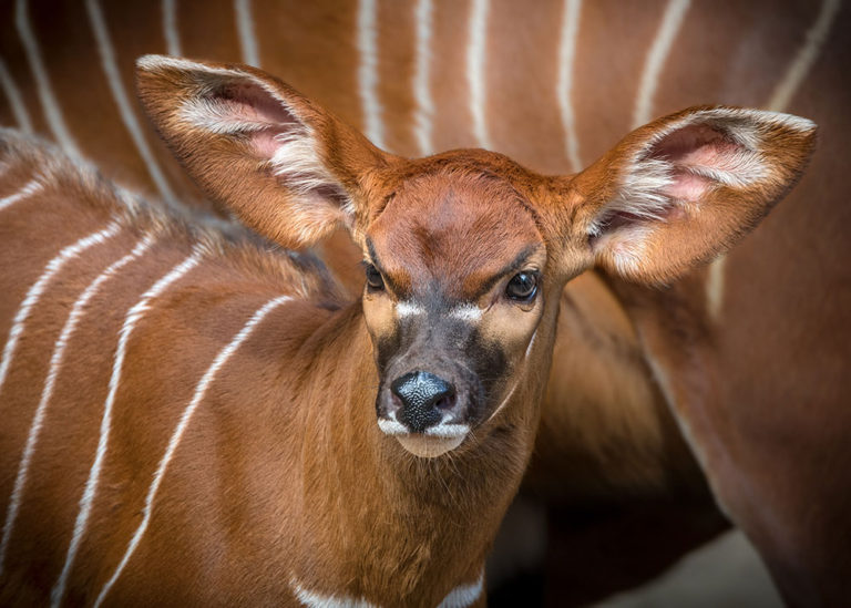
Los Angeles Zoo Male Bongo Baby by Jamie Pham
In some photos, those tufts of white fur in the ears look more like polka dots (see this Feb. 23, 2017 news item on phys.org).
A Feb. 22, 2017 Los Angeles Zoo news release tells the story,
A male, Eastern bongo calf was born at the Los Angeles Zoo on January 20, 2017 to five-year-old, first-time mother, Rizzo, and seven-year-old father Asa. The unnamed calf is special because he is the first bongo baby the Zoo has welcomed in over 20 years. The L.A. Zoo has always exhibited Eastern bongo [sic], a large antelope found in Kenya, but the Zoo recently made breeding the species a priority due to its dwindling numbers in the wild. Because of problems with logging and poaching, there are currently less than 100 individuals that survive in four fragmented areas in the Aberdares Forest and on Mt. Kenya.
“This birth is a true testament to the work zoos are doing to sustain critically endangered species,” said Josh Sisk, Curator of Mammals at the Los Angeles Zoo. “Babies like this little bongo calf engage visitors and allow the Zoo to spread their conservation message. It is our hope that he will one day father offspring of his own.”
The bongo are a precocial species, or relatively mature and mobile from the moment of birth. The calf was standing and walking within an hour of being born and observed nursing within the first 24 hours. He spent quality time bonding with his mother Rizzo behind the scenes until he was introduced to the rest of the herd, female Frenchy (5), female Sandy (12), and father Asa on Feb. 15. Also housed in the same habitat are two yellow-backed duikers, a forest-dwelling antelope found mainly in central and western Africa. The bongo calf has been very curious of new [sic] his neighbors and has expressed interest in getting to know them better.
The calf is large, standing at just under two feet tall and weighing 55 pounds at birth. He has a chestnut-red coat with 10-14 vertical white stripes, a coloration that is an effective camouflage for the bongo’s forest habitat in the wild. The adult bongos in the herd stand at around four and a half feet at the shoulder with the male weighing 800 pounds and the females averaging 500 pounds. Perhaps the most distinct physical characteristic that sets the bongo herd apart from other hoofstock in the Zoo’s collection are their large ears. Unlike many antelope that live on open plains, the bongo relies on hearing more than eyesight given the obstructions of the thick forest in which they reside in the wild. The baby was already born with ears measuring six inches in length! The adult bongos also have long, impressive horns measuring up to 40 inches in length. The calf can expect to start growing horns like the rest of the herd by the time he reaches his first birthdate.
Guests can now observe the male calf along with the rest of the herd in their habitat daily, weather permitting.
STEM (science, technology, engineering, mathematics) toys a major revenue source for retailers?
Rina Raphael writes about the growing interest major retailers have shown in STEM toys in her March 3, 2017 article for Fast Company (Note: Link have been removed),
From code-teaching caterpillars to colorful chemistry kits, manufacturers and retailers alike are eager to cash in on a growing toy sector, known by the buzzworthy term STEM, that promises to deliver on science, technology, engineering, and math education.
Retailers are taking different approaches: Target, Best Buy, and Walmart are amping up their store aisles, while Toys “R” Us and National Geographic are producing their own line of STEM products.
One of the most surprising moves comes from Amazon, which recently launched a monthly STEM Club, an offshoot of the STEM Toys & Games Store it opened just two years ago. For $19.99 a month, kids receive new toys that promise to develop their skills.
“It’s making it more convenient than ever for parents to give their kids the gift of having fun while learning,” says Eva Lorenz, category leader of Toys & Games for Amazon. “STEM Club was designed with busy parents in mind.”
…
STEM sales still only account for two to three percent of the toy market, but the sector is “growing fast,” says Juli Lennett, toy industry analyst for NPD Group. Overall retail sales revenue in the U.S. reached $20 billion in the last year.
Amazon is taking advantage of that growth in a way that speaks to how people shop today. STEM is not mass market and likely never will be, but its fans are committed parents who take education seriously. “And once [Amazon] gets the consumer, they want to keep them,” says Lennett. “What better way to keep your consumer than with a continuity program that repeats… keeping them coming back month after month?”
Perception plays a big role in this industry. With STEM, parents are more inclined to spend money because they don’t necessarily view the purchases as “toys,” but rather as educational aids.
“The great marketing message for STEM is that it makes your kid smart and it’s educational and good for them, like eating an apple,” explains Lennett, noting there are both positive and negative aspects to that.
First, some parents want to leave playtime as was originally intended—for pure play, without any underlying agenda. The other issue is identifying criteria: What constitutes a STEM toy?
…
There are more than 50,000 toys on the market and industry insiders are actively attempting to track which toys belong in the educational prestige category. Some toys are more “soft STEM,” leaning more toward toyotic, while others are more serious products that may even boast snap circuits.
And then there is the truly dubious: At the 2017 International Toy Fair, “I saw a bag of sand with STEM on it,” Lennett recalls.
For industry experts, STEM criteria includes: When the child does something, does the toy change in some way? In that sense, asks Lennett, does a Rubik’s Cube count as STEM? “These are all questions we’re asking ourselves.”
Marissa DiBartolo, senior editor of The Toy Insider, agrees that many items across various categories can be considered STEM-related. STEM is “extremely important” for a child’s early education, she says, but notes that a toy doesn’t have the word “science” strewn on the box to be fit the category.
“If you break down the most basic concepts of science, technology, engineering, and mathematics, you’re looking at things like sequencing, matching, building, planning, and more,” said DiBartolo. “More toys than you think are educational or at least have educational benefits.”
Proper labeling within the category is a top concern for Toys “R” Us. While some retailers might dedicate an aisle to STEM, Toys “R” Us labels items throughout the entire store. The iconic toy retailer also partnered with educators to produce their own private STEM brands, called Imaginarium and Edu Science, and to correctly identify all available qualifying merchandise.
“We don’t just slap on a label,” says company spokesman Candace Disler. “We ensure it’s well thought out.”
If you have the time, I suggest you read Raphael’s article in its entirety.
Logos and the City of Vancouver (Canada)

The new City of Vancouver logo, shown at the top, was commissioned to replace the former logo, shown on the bottom. (City of Vancouver)
That top logo just cost the city $8000. (sigh) After protest, a halt has been called on the rollout of the new logo/wordmark. Interestingly, it appears the new logo was being used on city stationery prior to the City Council vote approving it on Feb. 22, 2017. A March 1, 2017 online article by Kendra Mangione for CTV News details some interesting shenanigans,
While the roll-out of the new logo on some city assets has been put on hold, staff members are already using it on brochures and business cards being handed out in city buildings and through the mail.
Robertson said staff have been using it “for some time,” even before its use was approved [emphasis mine], because the old logo “basically wouldn’t show up in some applications.”
He said there was a bit of a transition period, then city staff decided they needed to get formal approval from council before using it in any more permanent ways.
With a report from CTV Vancouver’s Sarah MacDonald
Sooooo this is interesting. @CityofVancouver said they’d phase in new logo as items need replacing, but I just got this at info counter.


Mike Howell in his March 1, 2017 article for the Vancouver Courier about the brouhaha provides some insight into the thinking at City Hall,
The proposed logo is done in Gotham font face, with a smaller point-sized “City of” in green stacked on a larger point-sized “Vancouver” in blue. It was supposed to replace a similar logo, set off by a lotus petal design.
In a Feb. 22 [2017] debate at city hall on the proposed logo, Robertson described the current logo as “lame.”
“It clearly isn’t doing its job anymore,” the mayor said. “And I think many would say it never really did its job as a bland logo with a squiggly bit on it that doesn’t mean anything to many people.”
A city report that went before council said the proposed logo “presents an updated image of the City of Vancouver as a modern, innovative and highly desirable place to live and work.” The report added the city’s “visual identity” had not been updated in more than 10 years.
“A simpler visual identity will not only be more easily recognized and understood by those for whom English is not a first language, but can be more easily adapted for social media channels,” the report said.
I gather Mayor Robertson has become an arbiter of aesthetic taste “… bland logo … .” I have to confess that I can’t fathom why the new logo is less bland than the old one. As for the report stating that the logo will “… be more easily recognized and understood by those for whom English is not a first language … .” I don’t understand how changing the colours makes the logo more easily understood. Is there anyone out there who could explain that for me? As for the new logo being more easily adapted for social media channels, presumably the logo will be shrunken down in size and experience tells me that a thick font such as this new one look like blobs in smaller sizes. I suppose you could use another font but doesn’t that rundercut the argument for a new logo?
Adding to the maelstrom is another logo, one for the City of Chilliwack,
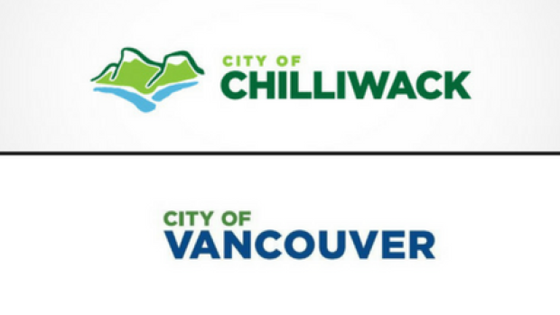
The City of Chilliwack logo was commissioned in 2011. The new City of Vancouver wordmark was approved by council earlier this week. (City of Chilliwack/City of Vancouver)
As Rhianna Schmunk notes in her Feb. 24, 2017 CBC (Canadian Broadcasting Corporation) online news article, there is a similarity (Note: A link has been removed),
The entrepreneur behind the City of Chilliwack’s logo said he was left shocked and frustrated after he saw the City of Vancouver’s brand new wordmark, which bears a resemblance to his 2011 creation.
Dan Mansell said a friend tagged him in a Facebook post about the Vancouver’s new branding after it was approved by city councillors earlier this week.
…
Mansell said he thinks the two designs are “too close to be a coincidence.”
“If this was a city in Australia, I wouldn’t be so mad. If this was a city in a different part of Canada, whatever. But this … we share the same highway.”
“My bet is that the designer was researching other city branding and looked at what I did with the City of Chilliwack and maybe subconsciously copied it or got too fixated [on it],” he said. “But I obviously don’t know the process for sure.”
…
He declined to say how much he received for the project, but said it was “certainly less” than the $8,000 shelled out by Vancouver.
“That’s the extra infuriating part,” the designer said.
One final comment about this logo situation, the cost is much more than $8000. when you add up the cost of changing all of the branding. Yes, it’s stopped for now but I would like to know just how much the rebranding has cost to date given that city staff were already rolling out the new materials prior to approval by the city council.
So there you have my 5000th posting.
ETA March 3, 2017 at 2:20 pm PST: Drat! I made a mistake ‘pot pourri’ has been changed to ‘potpourri’.