Tag Archives: Hanspeter Pfister

Nanoscale imaging of a mouse brain

Researchers have developed a new brain imaging tool they would like to use as a founding element for a national brain observatory. From a July 30, 2015 news item on Azonano,

A new imaging tool developed by Boston scientists could do for the brain what the telescope did for space exploration.

In the first demonstration of how the technology works, published July 30 in the journal Cell, the researchers look inside the brain of an adult mouse at a scale previously unachievable, generating images at a nanoscale resolution. The inventors’ long-term goal is to make the resource available to the scientific community in the form of a national brain observatory.

A July 30, 2015 Cell Press news release on EurekAlert, which originated the news item, expands on the theme,

“I’m a strong believer in bottom up-science, which is a way of saying that I would prefer to generate a hypothesis from the data and test it,” says senior study author Jeff Lichtman, of Harvard University. “For people who are imagers, being able to see all of these details is wonderful and we’re getting an opportunity to peer into something that has remained somewhat intractable for so long. It’s about time we did this, and it is what people should be doing about things we don’t understand.”

The researchers have begun the process of mining their imaging data by looking first at an area of the brain that receives sensory information from mouse whiskers, which help the animals orient themselves and are even more sensitive than human fingertips. The scientists used a program called VAST, developed by co-author Daniel Berger of Harvard and the Massachusetts Institute of Technology, to assign different colors and piece apart each individual “object” (e.g., neuron, glial cell, blood vessel cell, etc.).

“The complexity of the brain is much more than what we had ever imagined,” says study first author Narayanan “Bobby” Kasthuri, of the Boston University School of Medicine. “We had this clean idea of how there’s a really nice order to how neurons connect with each other, but if you actually look at the material it’s not like that. The connections are so messy that it’s hard to imagine a plan to it, but we checked and there’s clearly a pattern that cannot be explained by randomness.”

The researchers see great potential in the tool’s ability to answer questions about what a neurological disorder actually looks like in the brain, as well as what makes the human brain different from other animals and different between individuals. Who we become is very much a product of the connections our neurons make in response to various life experiences. To be able to compare the physical neuron-to-neuron connections in an infant, a mathematical genius, and someone with schizophrenia would be a leap in our understanding of how our brains shape who we are (or vice versa).

The cost and data storage demands for this type of research are still high, but the researchers expect expenses to drop over time (as has been the case with genome sequencing). To facilitate data sharing, the scientists are now partnering with Argonne National Laboratory with the hopes of creating a national brain laboratory that neuroscientists around the world can access within the next few years.

“It’s bittersweet that there are many scientists who think this is a total waste of time as well as a big investment in money and effort that could be better spent answering questions that are more proximal,” Lichtman says. “As long as data is showing you things that are unexpected, then you’re definitely doing the right thing. And we are certainly far from being out of the surprise element. There’s never a time when we look at this data that we don’t see something that we’ve never seen before.”

Here’s a link to and a citation for the paper,

Saturated Reconstruction of a Volume of Neocortex by Narayanan Kasthuri, Kenneth Jeffrey Hayworth, Daniel Raimund Berger, Richard Lee Schalek, José Angel Conchello, Seymour Knowles-Barley, Dongil Lee, Amelio Vázquez-Reina, Verena Kaynig, Thouis Raymond Jones, Mike Roberts, Josh Lyskowski Morgan, Juan Carlos Tapia, H. Sebastian Seung, William Gray Roncal, Joshua Tzvi Vogelstein, Randal Burns, Daniel Lewis Sussman, Carey Eldin Priebe, Hanspeter Pfister, Jeff William Lichtman. Cell Volume 162, Issue 3, p648–661, 30 July 2015 DOI: http://dx.doi.org/10.1016/j.cell.2015.06.054

This appears to be an open access paper.
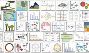
Chart junk: rethinking science data visualization

Which of these visualizations will you remember later? (Images courtesy of Michelle Borkin, Harvard SEAS.)

Which of these visualizations will you remember later? (Images courtesy of Michelle Borkin, Harvard SEAS.)

This chart of data visualization images accompanies an Oct. 16, 2013 news item on ScienceDaily concerning some research into what makes some charts more memorable than others,

It’s easy to spot a “bad” data visualization — one packed with too much text, excessive ornamentation, gaudy colors, and clip art. Design guru Edward Tufte derided such decorations as redundant at best, useless at worst, labeling them “chart junk.” Yet a debate still rages among visualization experts: Can these reviled extra elements serve a purpose?

Taking a scientific approach to design, researchers from Harvard University and Massachusetts Institute of Technology are offering a new take on that debate. The same design elements that attract so much criticism, they report, can also make a visualization more memorable.

Detailed results were presented this week at the IEEE Information Visualization (InfoVis) conference in Atlanta, hosted by the Institute of Electrical and Electronics Engineers.

The Oct. 16, 2013 School of Engineering and Applied Sciences (SEAS) Harvard University news release (also on EurekAlert), which originated the news item, details some of the ways in which the researchers attempted to study data visualizations and memorability (Note: Links from the news release to be found on the SEAS website have been removed),

For lead author Michelle Borkin, a doctoral student at the Harvard School of Engineering and Applied Sciences (SEAS), memorability has a particular importance:

“I spend a lot of my time reading these scientific papers, so I have to wonder, when I walk away from my desk, what am I going to remember? Which of the figures and visualizations in these publications are going to stick with me?”

But it’s more than grad-school anxiety. Working at the interface of computer science and psychology, Borkin specializes in the visual representation of data, looking for the best ways to communicate and interpret complex information. The applications of her work have ranged from astronomy to medical diagnostics and may already help save lives.

Her adviser, Hanspeter Pfister, An Wang Professor of Computer Science at Harvard SEAS, was intrigued by the chart junk debate, which has flared up on design blogs and at visualization conferences year after year.

Together, they turned to Aude Oliva, a principal research scientist at MIT’s Computer Science and Artificial Intelligence Lab, and a cognitive psychologist by training. Oliva’s lab has been studying visual memory for about six years now. Her team has found that in photographs, faces and human-centric scenes are typically easy to remember; landscapes are not.

“All of us are sensitive to the same kinds of images, and we forget the same kind as well,” Oliva says. “We like to believe our memories are unique, that they’re like the soul of a person, but in certain situations it’s as if we have the same algorithm in our heads that is going to be sensitive to a particular type of image. So when you find a result like this in photographs, you want to know: is it generalizable to many types of materials—words, sound, images, graphs?”

“Speaking with [Pfister] and his group, it became very exciting, the idea that we could study what makes a visualization memorable or not,” Oliva recalls. “If it turned out to be the same for everyone, we thought this would be a win-win result.”

For Oliva’s group, it would provide more evidence of cognitive similarities in the brain’s visual processing, from person to person. For Pfister’s group, it could suggest that certain design principles make visualizations inherently more memorable than others.

With Harvard students Azalea A. Vo ’13 and Shashank Sunkavalli SM ’13, as well as MIT graduate students Zoya Bylinskii and Phillip Isola, the team designed a large-scale study—in the form of an online game—to rigorously measure the memorability of a wide variety of visualizations. They collected more than 5,000 charts and graphics from scientific papers, design blogs, newspapers, and government reports and manually categorized them by a wide range of attributes. Serving them up in brief glimpses—just one second each—to participants via Amazon Mechanical Turk, the researchers tested the influence of features like color, density, and content themes on users’ ability to recognize which ones they had seen before.

The results meshed well with Oliva’s previous results, but added several new insights.

“A visualization will be instantly and overwhelmingly more memorable if it incorporates an image of a human-recognizable object—if it includes a photograph, people, cartoons, logos—any component that is not just an abstract data visualization,” says Pfister. “We learned that any time you have a graphic with one of those components, that’s the most dominant thing that affects the memorability.”

Visualizations that were visually dense proved memorable, as did those that used many colors. Other results were more surprising.

“You’d think the types of charts you’d remember best are the ones you learned in school—the bar charts, pie charts, scatter plots, and so on,” Borkin says. “But it was the opposite.”

Unusual types of charts, like tree diagrams, network diagrams, and grid matrices, were actually more memorable.

“If you think about those types of diagrams—for example, tree diagrams that show relationships between species, or diagrams that explain a molecular chemical process—every one of them is going to be a little different, but the branching structures feel very natural to us,” explains Borkin. “That combination of the familiar and the unique seems to influence the memorability.”

The best type of chart to use will always depend on the data, but for designers who are required to work within a certain style—for example, to achieve a recognizable consistency within a magazine—the results may be reassuring.

“A graph can be simple or complex, and they both can be memorable,” explains Oliva. “You can make something familiar either by keeping it simple or by having a little story around it. It’s not really that you should choose to use one color or many, or to include additional ornaments or not. If you need to keep it simple because it’s the style your boss likes or the style of your publication, you can still find a way to make it memorable.”

At this stage, however, the team hesitates to issue any sweeping design guidelines for an obvious reason: memorability isn’t the only thing that matters. Visualizations must also be accurate, easy to comprehend, aesthetically pleasing, and appropriate to the context.

“A memorable visualization is not necessarily a good visualization,” Borkin cautions. “As a community we need to keep asking these types of questions: What makes a visualization engaging? What makes it comprehensible?”

As for the chart junk, she says diplomatically, “I think it’s going to be an ongoing debate.”

I believe Michelle Borkin is the lead author of an unpublished (as yet) paper submitted to the 2013 IEEE Information Visualization (InfoVis) conference, which means I can’t offer a link to or a citation for the paper.