Category Archives: visual data

Democratizing science .. neuroscience that is

What is going on with the neuroscience folks? First it was Montreal Neuro opening up its science  as featured in my January 22, 2016 posting,

The Montreal Neurological Institute (MNI) in Québec, Canada, known informally and widely as Montreal Neuro, has ‘opened’ its science research to the world. David Bruggeman tells the story in a Jan. 21, 2016 posting on his Pasco Phronesis blog (Note: Links have been removed),

The Montreal Neurological Institute (MNI) at McGill University announced that it will be the first academic research institute to become what it calls ‘Open Science.’  As Science is reporting, the MNI will make available all research results and research data at the time of publication.  Additionally it will not seek patents on any of the discoveries made on research at the Institute.

Will this catch on?  I have no idea if this particular combination of open access research data and results with no patents will spread to other university research institutes.  But I do believe that those elements will continue to spread.  More universities and federal agencies are pursuing open access options for research they support.  Elon Musk has opted to not pursue patent litigation for any of Tesla Motors’ patents, and has not pursued patents for SpaceX technology (though it has pursued litigation over patents in rocket technology). …

Whether or not they were inspired by the MNI, the scientists at the University of Washington (UW [state]) have found their own unique way of opening up science. From a March 15, 2018 UW news blog posting (also on EurekAlert) by James Urton, Note: Links have been removed,

Over the past few years, scientists have faced a problem: They often cannot reproduce the results of experiments done by themselves or their peers.

This “replication crisis” plagues fields from medicine to physics, and likely has many causes. But one is undoubtedly the difficulty of sharing the vast amounts of data collected and analyses performed in so-called “big data” studies. The volume and complexity of the information also can make these scientific endeavors unwieldy when it comes time for researchers to share their data and findings with peers and the public.

Researchers at the University of Washington have developed a set of tools to make one critical area of big data research — that of our central nervous system — easier to share. In a paper published online March 5 [2018] in Nature Communications, the UW team describes an open-access browser they developed to display, analyze and share neurological data collected through a type of magnetic resonance imaging study known as diffusion-weighted MRI.

“There has been a lot of talk among researchers about the replication crisis,” said lead author Jason Yeatman. “But we wanted a tool — ready, widely available and easy to use — that would actually help fight the replication crisis.”

Yeatman — who is an assistant professor in the UW Department of Speech & Hearing Sciences and the Institute for Learning & Brain Sciences (I-LABS) — is describing AFQ-Browser. This web browser-based tool, freely available online, is a platform for uploading, visualizing, analyzing and sharing diffusion MRI data in a format that is publicly accessible, improving transparency and data-sharing methods for neurological studies. In addition, since it runs in the web browser, AFQ-Browser is portable — requiring no additional software package or equipment beyond a computer and an internet connection.

“One major barrier to data transparency in neuroscience is that so much data collection, storage and analysis occurs on local computers with special software packages,” said senior author Ariel Rokem, a senior data scientist in the UW eScience Institute. “But using AFQ-Browser, we eliminate those requirements and make uploading, sharing and analyzing diffusion-weighted MRI data a simple, straightforward process.”

Diffusion-weighted MRI measures the movement of fluid in the brain and spinal cord, revealing the structure and function of white-matter tracts. These are the connections of the central nervous system, tissue that are made up primarily of axons that transmit long-range signals between neural circuits. Diffusion MRI research on brain connectivity has fundamentally changed the way neuroscientists understand human brain function: The state, organization and layout of white matter tracts are at the core of cognitive functions such as memory, learning and other capabilities. Data collected using diffusion-weighted MRI can be used to diagnose complex neurological conditions such as multiple sclerosis (MS) and amyotrophic lateral sclerosis (ALS). Researchers also use diffusion-weighted MRI data to study the neurological underpinnings of conditions such as dyslexia and learning disabilities.

“This is a widely-used technique in neuroscience research, and it is particularly amenable to the benefits that can be gleaned from big data, so it became a logical starting point for developing browser-based, open-access tools for the field,” said Yeatman.

The AFQ-Browser — the AFQ stands for Automated Fiber-tract Quantification — can receive diffusion-weighted MRI data and perform tract analysis for each individual subject. The analyses occur via a remote server, again eliminating technical and financial barriers for researchers. The AFQ-Browser also contains interactive tools to display data for multiple subjects — allowing a researcher to easily visualize how white matter tracts might be similar or different among subjects, identify trends in the data and generate hypotheses for future experiments. Researchers also can insert additional code to analyze the data, as well as save, upload and share data instantly with fellow researchers.

“We wanted this tool to be as generalizable as possible, regardless of research goals,” said Rokem. “In addition, the format is easy for scientists from a variety of backgrounds to use and understand — so that neuroscientists, statisticians and other researchers can collaborate, view data and share methods toward greater reproducibility.”

The idea for the AFQ-Browser came out of a UW course on data visualization, and the researchers worked with several graduate students to develop and perfect the browser. They tested it on existing diffusion-weighted MRI datasets, including research subjects with ALS and MS. In the future, they hope that the AFQ-Browser can be improved to do automated analyses — and possibly even diagnoses — based on diffusion-weighted MRI data.

“AFQ-Browser is really just the start of what could be a number of tools for sharing neuroscience data and experiments,” said Yeatman. “Our goal here is greater reproducibility and transparency, and a more robust scientific process.”

Here are a couple of images the researchers have used to illustrate their work,

AFQ-Browser.Jason Yeatman/Ariel Rokem Courtesy: University of Washington

Depiction of the left hemisphere of the human brain. Colored regions are selected white matter regions that could be measured using diffusion-weighted MRI: Corticospinal tract (orange), arcuate fasciculus (blue) and cingulum (green).Jason Yeatman/Ariel Rokem

You can find an embedded version of the AFQ-Browser here: http://www.washington.edu/news/2018/03/15/democratizing-science-researchers-make-neuroscience-experiments-easier-to-share-reproduce/ (scroll down about 50 – 55% of the way).

As for the paper, here’s a link and a citation,

A browser-based tool for visualization and analysis of diffusion MRI data by Jason D. Yeatman, Adam Richie-Halford, Josh K. Smith, Anisha Keshavan, & Ariel Rokem. Nature Communicationsvolume 9, Article number: 940 (2018) doi:10.1038/s41467-018-03297-7 Published online: 05 March 2018

Fittingly, this paper is open access.

Out Of This World; Art inspired by all things astronomical from July 4 – 22, 2018 in Toronto, Canada

From a June 29, 2018 ArtSci Salon notice (received via email),

July 4 – 22  | Out Of This World | Juried Group Exhibition

“ Space… is big. Really big. You just won’t believe how vastly, hugely, mindbogglingly big it is. I mean, you may think it’s a long way down the road to the chemist’s, but that’s just peanuts to space.”
– DOUGLAS ADAMS: THE HITCHHIKER’S GUIDE TO THE GALAXY (1979)


July 4 – 22  | Out of this World | Juried Group Exhibition
Opening Reception: Thurs. July 5th, 7 – 10 pm. (with telescopes! weather permitting… and astronomically-themed music from the 17th and 18th centuries)

2018 marks a century-and-a-half of the Royal Astronomical Society of Canada’s (RASC) promotion of astronomy and allied sciences in Canada. From early on, the RASC has encouraged exploring the connections of astronomy with other areas of culture, an interest which continues to the present. Propeller Gallery has partnered with the RASC to present an exhibition celebrating their sesquicentennial.

Astronomy, with its highly evocative imagery, and mindboggling and mindbending ideas about our Universe, provides artists with richly visual and deeply conceptual inspiration. Out of This World features a diverse array of work inspired by the cosmos, ranging from the visualization of astronomical data to textiles, video and installation. A select number of works from the archives of the RASC are also presented.

Participating Artists: Michael Black | Linda-Marlena Bucholtz Ross | David Cumming | Chris Domanski | Trinley Dorje | Dan Falk | Maya Foltyn | Peter Friedrichsen | Susan Gaby-Trotz | Aryan Ghaemmaghami | David Griffin | Xianda Guo, Charlotte Mueller, Sinead Lynch, Ramona Fluck, Christoph Blapp & Jayanne English | Diana Hamer | Chris Harms  | Angela Julian | Adam Kolodziej  | Irena IRiKO Kolodziej | Nancy Lalicon | Michelle Letarte | Shannon Leigh  | Elizabeth Lopez | Trevor McKinven | France McNeil  | John Ming Mark | Giuseppe Morano | Sarah Moreau  | Joseph Muscat  | Pria Muzumdar  | Neeko Paluzzi | Frances Patella | Donna Wells | Donna Wise | plus archival work from the Royal Astronomical Society of Canada

Curatorial Team: Robin Kingsburgh, Tony Saad, David Griffin, Randall Rosenfeld

Panel discussion: Understanding Astronomical Images, Saturday July 14, 1:30-3pm

Artist Talks and Star Party in Lisgar Park: Saturday July 21, 7pm+ (Join us in the gallery at 7pm for informal talks by artists about their work. Follow us outside to Lisgar Park across the street when it gets dark – where members of the RASC and York University will set up telescopes.)

As for exactly where the show, panel discussions, and artist talks are taking place,

Propeller Gallery
30 Abell Street, Toronto, ON M6J 0A9
416-504-7142

www.propellerctr.com
gallery@propellerctr.com

Happy star gazing!

Gold’s origin in the universe due to cosmic collision

An hypothesis for gold’s origins was first mentioned here in a May 26, 2016 posting,

The link between this research and my side project on gold nanoparticles is a bit tenuous but this work on the origins for gold and other precious metals being found in the stars is so fascinating and I’m determined to find a connection.

An artist's impression of two neutron stars colliding. (Credit: Dana Berry / Skyworks Digital, Inc.) Courtesy: Kavli Foundation

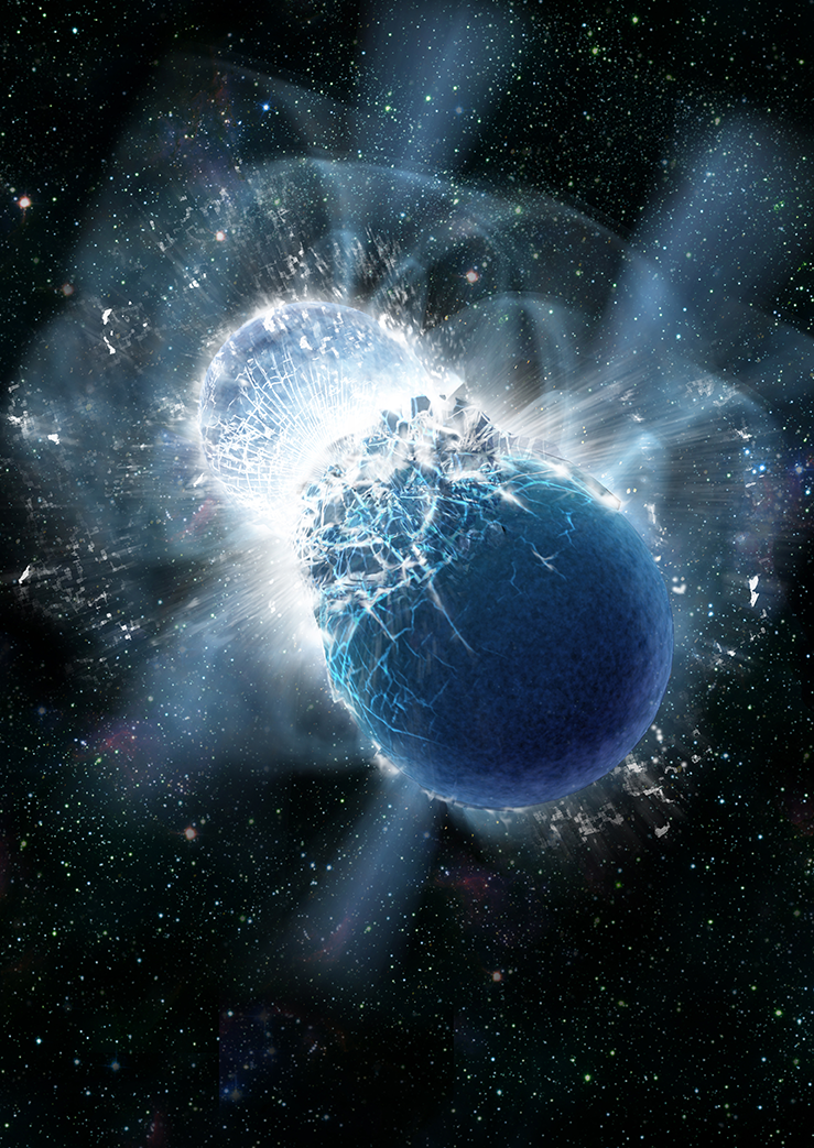
An artist’s impression of two neutron stars colliding. (Credit: Dana Berry / Skyworks Digital, Inc.) Courtesy: Kavli Foundation

From a May 19, 2016 news item on phys.org,

The origin of many of the most precious elements on the periodic table, such as gold, silver and platinum, has perplexed scientists for more than six decades. Now a recent study has an answer, evocatively conveyed in the faint starlight from a distant dwarf galaxy.

In a roundtable discussion, published today [May 19, 2016?], The Kavli Foundation spoke to two of the researchers behind the discovery about why the source of these heavy elements, collectively called “r-process” elements, has been so hard to crack.

From the Spring 2016 Kavli Foundation webpage hosting the  “Galactic ‘Gold Mine’ Explains the Origin of Nature’s Heaviest Elements” Roundtable ,

Astronomers studying a galaxy called Reticulum II have just discovered that its stars contain whopping amounts of these metals—collectively known as “r-process” elements (See “What is the R-Process?”). Of the 10 dwarf galaxies that have been similarly studied so far, only Reticulum II bears such strong chemical signatures. The finding suggests some unusual event took place billions of years ago that created ample amounts of heavy elements and then strew them throughout the galaxy’s reservoir of gas and dust. This r-process-enriched material then went on to form Reticulum II’s standout stars.

Based on the new study, from a team of researchers at the Kavli Institute at the Massachusetts Institute of Technology, the unusual event in Reticulum II was likely the collision of two, ultra-dense objects called neutron stars. Scientists have hypothesized for decades that these collisions could serve as a primary source for r-process elements, yet the idea had lacked solid observational evidence. Now armed with this information, scientists can further hope to retrace the histories of galaxies based on the contents of their stars, in effect conducting “stellar archeology.”

Researchers have confirmed the hypothesis according to an Oct. 16, 2017 news item on phys.org,

Gold’s origin in the Universe has finally been confirmed, after a gravitational wave source was seen and heard for the first time ever by an international collaboration of researchers, with astronomers at the University of Warwick playing a leading role.

Members of Warwick’s Astronomy and Astrophysics Group, Professor Andrew Levan, Dr Joe Lyman, Dr Sam Oates and Dr Danny Steeghs, led observations which captured the light of two colliding neutron stars, shortly after being detected through gravitational waves – perhaps the most eagerly anticipated phenomenon in modern astronomy.

Marina Koren’s Oct. 16, 2017 article for The Atlantic presents a richly evocative view (Note: Links have been removed),

Some 130 million years ago, in another galaxy, two neutron stars spiraled closer and closer together until they smashed into each other in spectacular fashion. The violent collision produced gravitational waves, cosmic ripples powerful enough to stretch and squeeze the fabric of the universe. There was a brief flash of light a million trillion times as bright as the sun, and then a hot cloud of radioactive debris. The afterglow hung for several days, shifting from bright blue to dull red as the ejected material cooled in the emptiness of space.

Astronomers detected the aftermath of the merger on Earth on August 17. For the first time, they could see the source of universe-warping forces Albert Einstein predicted a century ago. Unlike with black-hole collisions, they had visible proof, and it looked like a bright jewel in the night sky.

But the merger of two neutron stars is more than fireworks. It’s a factory.

Using infrared telescopes, astronomers studied the spectra—the chemical composition of cosmic objects—of the collision and found that the plume ejected by the merger contained a host of newly formed heavy chemical elements, including gold, silver, platinum, and others. Scientists estimate the amount of cosmic bling totals about 10,000 Earth-masses of heavy elements.

I’m not sure exactly what this image signifies but it did accompany Koren’s article so presumably it’s a representation of colliding neutron stars,

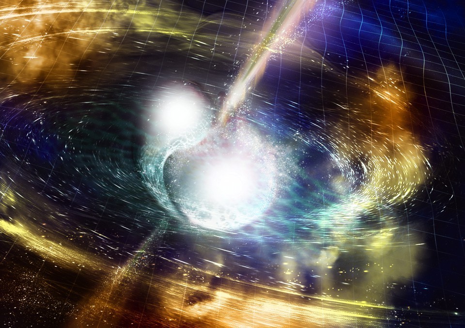
NSF / LIGO / Sonoma State University /A. Simonnet. Downloaded from: https://www.theatlantic.com/science/archive/2017/10/the-making-of-cosmic-bling/543030/

An Oct. 16, 2017 University of Warwick press release (also on EurekAlert), which originated the news item on phys.org, provides more detail,

Huge amounts of gold, platinum, uranium and other heavy elements were created in the collision of these compact stellar remnants, and were pumped out into the universe – unlocking the mystery of how gold on wedding rings and jewellery is originally formed.

The collision produced as much gold as the mass of the Earth. [emphasis mine]

This discovery has also confirmed conclusively that short gamma-ray bursts are directly caused by the merging of two neutron stars.

The neutron stars were very dense – as heavy as our Sun yet only 10 kilometres across – and they collided with each other 130 million years ago, when dinosaurs roamed the Earth, in a relatively old galaxy that was no longer forming many stars.

They drew towards each other over millions of light years, and revolved around each other increasingly quickly as they got closer – eventually spinning around each other five hundred times per second.

Their merging sent ripples through the fabric of space and time – and these ripples are the elusive gravitational waves spotted by the astronomers.

The gravitational waves were detected by the Advanced Laser Interferometer Gravitational-Wave Observatory (Adv-LIGO) on 17 August this year [2017], with a short duration gamma-ray burst detected by the Fermi satellite just two seconds later.

This led to a flurry of observations as night fell in Chile, with a first report of a new source from the Swope 1m telescope.

Longstanding collaborators Professor Levan and Professor Nial Tanvir (from the University of Leicester) used the facilities of the European Southern Observatory to pinpoint the source in infrared light.

Professor Levan’s team was the first one to get observations of this new source with the Hubble Space Telescope. It comes from a galaxy called NGC 4993, 130 million light years away.

Andrew Levan, Professor in the Astronomy & Astrophysics group at the University of Warwick, commented: “Once we saw the data, we realised we had caught a new kind of astrophysical object. This ushers in the era of multi-messenger astronomy, it is like being able to see and hear for the first time.”

Dr Joe Lyman, who was observing at the European Southern Observatory at the time was the first to alert the community that the source was unlike any seen before.

He commented: “The exquisite observations obtained in a few days showed we were observing a kilonova, an object whose light is powered by extreme nuclear reactions. This tells us that the heavy elements, like the gold or platinum in jewellery are the cinders, forged in the billion degree remnants of a merging neutron star.”

Dr Samantha Oates added: “This discovery has answered three questions that astronomers have been puzzling for decades: what happens when neutron stars merge? What causes the short duration gamma-ray bursts? Where are the heavy elements, like gold, made? In the space of about a week all three of these mysteries were solved.”

Dr Danny Steeghs said: “This is a new chapter in astrophysics. We hope that in the next few years we will detect many more events like this. Indeed, in Warwick we have just finished building a telescope designed to do just this job, and we expect it to pinpoint these sources in this new era of multi-messenger astronomy”.

Congratulations to all of the researchers involved in this work!

Many, many research teams were  involved. Here’s a sampling of their news releases which focus on their areas of research,

University of the Witwatersrand (South Africa)

https://www.eurekalert.org/pub_releases/2017-10/uotw-wti101717.php

Weizmann Institute of Science (Israel)

https://www.eurekalert.org/pub_releases/2017-10/wios-cns101717.php

Carnegie Institution for Science (US)

https://www.eurekalert.org/pub_releases/2017-10/cifs-dns101217.php

Northwestern University (US)

https://www.eurekalert.org/pub_releases/2017-10/nu-adc101617.php

National Radio Astronomy Observatory (US)

https://www.eurekalert.org/pub_releases/2017-10/nrao-ru101317.php

Max-Planck-Gesellschaft (Germany)

https://www.eurekalert.org/pub_releases/2017-10/m-gwf101817.php

Penn State (Pennsylvania State University; US)

https://www.eurekalert.org/pub_releases/2017-10/ps-stl101617.php

University of California – Davis

https://www.eurekalert.org/pub_releases/2017-10/uoc–cns101717.php

The American Association for the Advancement of Science’s (AAAS) magazine, Science, has published seven papers on this research. Here’s an Oct. 16, 2017 AAAS news release with an overview of the papers,

https://www.eurekalert.org/pub_releases/2017-10/aaft-btf101617.php

I’m sure there are more news releases out there and that there will be many more papers published in many journals, so if this interests, I encourage you to keep looking.

Two final pieces I’d like to draw your attention to: one answers basic questions and another focuses on how artists knew what to draw when neutron stars collide.

Keith A Spencer’s Oct. 18, 2017 piece on salon.com answers a lot of basic questions for those of us who don’t have a background in astronomy. Here are a couple of examples,

What is a neutron star?

Okay, you know how atoms have protons, neutrons, and electrons in them? And you know how protons are positively charged, and electrons are negatively charged, and neutrons are neutral?

Yeah, I remember that from watching Bill Nye as a kid.

Totally. Anyway, have you ever wondered why the negatively-charged electrons and the positively-charged protons don’t just merge into each other and form a neutral neutron? I mean, they’re sitting there in the atom’s nucleus pretty close to each other. Like, if you had two magnets that close, they’d stick together immediately.

I guess now that you mention it, yeah, it is weird.

Well, it’s because there’s another force deep in the atom that’s preventing them from merging.

It’s really really strong.

The only way to overcome this force is to have a huge amount of matter in a really hot, dense space — basically shove them into each other until they give up and stick together and become a neutron. This happens in very large stars that have been around for a while — the core collapses, and in the aftermath, the electrons in the star are so close to the protons, and under so much pressure, that they suddenly merge. There’s a big explosion and the outer material of the star is sloughed off.

Okay, so you’re saying under a lot of pressure and in certain conditions, some stars collapse and become big balls of neutrons?

Pretty much, yeah.

So why do the neutrons just stick around in a huge ball? Aren’t they neutral? What’s keeping them together? 

Gravity, mostly. But also the strong nuclear force, that aforementioned weird strong force. This isn’t something you’d encounter on a macroscopic scale — the strong force only really works at the type of distances typified by particles in atomic nuclei. And it’s different, fundamentally, than the electromagnetic force, which is what makes magnets attract and repel and what makes your hair stick up when you rub a balloon on it.

So these neutrons in a big ball are bound by gravity, but also sticking together by virtue of the strong nuclear force. 

So basically, the new ball of neutrons is really small, at least, compared to how heavy it is. That’s because the neutrons are all clumped together as if this neutron star is one giant atomic nucleus — which it kinda is. It’s like a giant atom made only of neutrons. If our sun were a neutron star, it would be less than 20 miles wide. It would also not be something you would ever want to get near.

Got it. That means two giant balls of neutrons that weighed like, more than our sun and were only ten-ish miles wide, suddenly smashed into each other, and in the aftermath created a black hole, and we are just now detecting it on Earth?

Exactly. Pretty weird, no?

Spencer does a good job of gradually taking you through increasingly complex explanations.

For those with artistic interests, Neel V. Patel tries to answer a question about how artists knew what draw when neutron stars collided in his Oct. 18, 2017 piece for Slate.com,

All of these things make this discovery easy to marvel at and somewhat impossible to picture. Luckily, artists have taken up the task of imagining it for us, which you’ve likely seen if you’ve already stumbled on coverage of the discovery. Two bright, furious spheres of light and gas spiraling quickly into one another, resulting in a massive swell of lit-up matter along with light and gravitational waves rippling off speedily in all directions, towards parts unknown. These illustrations aren’t just alluring interpretations of a rare phenomenon; they are, to some extent, the translation of raw data and numbers into a tangible visual that gives scientists and nonscientists alike some way of grasping what just happened. But are these visualizations realistic? Is this what it actually looked like? No one has any idea. Which is what makes the scientific illustrators’ work all the more fascinating.

“My goal is to represent what the scientists found,” says Aurore Simmonet, a scientific illustrator based at Sonoma State University in Rohnert Park, California. Even though she said she doesn’t have a rigorous science background (she certainly didn’t know what a kilonova was before being tasked to illustrate one), she also doesn’t believe that type of experience is an absolute necessity. More critical, she says, is for the artist to have an interest in the subject matter and in learning new things, as well as a capacity to speak directly to scientists about their work.

Illustrators like Simmonet usually start off work on an illustration by asking the scientist what’s the biggest takeaway a viewer should grasp when looking at a visual. Unfortunately, this latest discovery yielded a multitude of papers emphasizing different conclusions and highlights. With so many scientific angles, there’s a stark challenge in trying to cram every important thing into a single drawing.

Clearly, however, the illustrations needed to center around the kilonova. Simmonet loves colors, so she began by discussing with the researchers what kind of color scheme would work best. The smash of two neutron stars lends itself well to deep, vibrant hues. Simmonet and Robin Dienel at the Carnegie Institution for Science elected to use a wide array of colors and drew bright cracking to show pressure forming at the merging. Others, like Luis Calcada at the European Southern Observatory, limited the color scheme in favor of emphasizing the bright moment of collision and the signal waves created by the kilonova.

Animators have even more freedom to show the event, since they have much more than a single frame to play with. The Conceptual Image Lab at NASA’s [US National Aeronautics and Space Administration] Goddard Space Flight Center created a short video about the new findings, and lead animator Brian Monroe says the video he and his colleagues designed shows off the evolution of the entire process: the rising action, climax, and resolution of the kilonova event.

The illustrators try to adhere to what the likely physics of the event entailed, soliciting feedback from the scientists to make sure they’re getting it right. The swirling of gas, the direction of ejected matter upon impact, the reflection of light, the proportions of the objects—all of these things are deliberately framed such that they make scientific sense. …

Do take a look at Patel’s piece, if for no other reason than to see all of the images he has embedded there. You may recognize Aurore Simmonet’s name from the credit line in the second image I have embedded here.

Making sense of the world with data visualization

A March 30, 2017 item on phys.org features an essay about data visualization,

The late data visionary Hans Rosling mesmerised the world with his work, contributing to a more informed society. Rosling used global health data to paint a stunning picture of how our world is a better place now than it was in the past, bringing hope through data.

Matt Escobar, postdoctoral researcher on machine learning applied to chemical engineering at the University of Tokyo, wrote this March 30, 2017 essay originally for The Conversation,

Now more than ever, data are collected from every aspect of our lives. From social media and advertising to artificial intelligence and automated systems, understanding and parsing information have become highly valuable skills. But we often overlook the importance of knowing how to communicate data to peers and to the public in an effective, meaningful way.

Hans Rosling paved the way for effectively communicating global health data. Vimeo

Data visualisation can take many other forms, just as data itself can be interpreted in many different ways. It can be used to highlight important achievements, as Bill and Melinda Gates have shown with their annual letters in which their main results and aspirations are creatively displayed.

Escobar goes on to explore a number of approaches to data visualization including this one,

Finding similarity between samples is another good starting point. Network analysis is a well-known technique that relies on establishing connections between samples (also called nodes). Strong connections between samples indicate a high level of similarity between features.

Once these connections are established, the network rearranges itself so that samples with like characteristics stick together. While before we were considering only the most relevant features of each live show and using that as reference, now all features are assessed simultaneously – similarity is more broadly defined.

Networks show a highly connected yet well-defined world.

The amount of information that can be visualised with networks is akin to dimensionality reduction, but the feature assessment aspect is now different. Whereas previously samples would be grouped based on a few specific marking features, in this tool samples that share many features stick together. That leaves it up to users to choose their approach based on their goals.

He finishes by noting that his essay is an introduction to a complex topic.

Mathematicians get illustrative

Frank A. Farris, an associate Professor of Mathematics at Santa Clara University (US), writes about the latest in mathematicians and data visualization in an April 4, 2017 essay on The Conversation (Note: Links have been removed),

Today, digital tools like 3-D printing, animation and virtual reality are more affordable than ever, allowing mathematicians to investigate and illustrate their work at the same time. Instead of drawing a complicated surface on a chalkboard, we can now hand students a physical model to feel or invite them to fly over it in virtual reality.

Last year, a workshop called “Illustrating Mathematics” at the Institute for Computational and Experimental Research in Mathematics (ICERM) brought together an eclectic group of mathematicians and digital art practitioners to celebrate what seems to be a golden age of mathematical visualization. Of course, visualization has been central to mathematics since Pythagoras, but this seems to be the first time it had a workshop of its own.

Visualization plays a growing role in mathematical research. According to John Sullivan at the Technical University of Berlin, mathematical thinking styles can be roughly categorized into three groups: “the philosopher,” who thinks purely in abstract concepts; “the analyst,” who thinks in formulas; and “the geometer,” who thinks in pictures.

Mathematical research is stimulated by collaboration between all three types of thinkers. Many practitioners believe teaching should be calibrated to connect with different thinking styles.

Borromean Rings, the logo of the International Mathematical Union. John Sullivan

Sullivan’s own work has benefited from images. He studies geometric knot theory, which involves finding “best” configurations. For example, consider his Borromean rings, which won the logo contest of the International Mathematical Union several years ago. The rings are linked together, but if one of them is cut, the others fall apart, which makes it a nice symbol of unity.

Apparently this new ability to think mathematics visually has influenced mathematicians in some unexpected ways,

Take mathematician Fabienne Serrière, who raised US$124,306 through Kickstarter in 2015 to buy an industrial knitting machine. Her dream was to make custom-knit scarves that demonstrate cellular automata, mathematical models of cells on a grid. To realize her algorithmic design instructions, Serrière hacked the code that controls the machine. She now works full-time on custom textiles from a Seattle studio.

In this sculpture by Edmund Harriss, the drill traces are programmed to go perpendicular to the growth rings of the tree. This makes the finished sculpture a depiction of a concept mathematicians know as ‘paths of steepest descent.’ Edmund Harriss, Author provided

Edmund Harriss of the University of Arkansas hacked an architectural drilling machine, which he now uses to make mathematical sculptures from wood. The control process involves some deep ideas from differential geometry. Since his ideas are basically about controlling a robot arm, they have wide application beyond art. According to his website, Harriss is “driven by a passion to communicate the beauty and utility of mathematical thinking.”

Mathematical algorithms power the products made by Nervous System, a studio in Massachusetts that was founded in 2007 by Jessica Rosenkrantz, a biologist and architect, and Jess Louis-Rosenberg, a mathematician. Many of their designs, for things like custom jewelry and lampshades, look like naturally occurring structures from biology or geology.

Farris’ essay is a fascinating look at mathematics and data visualization.

The role of empathy in science communication

Phys.org has a Dec. 12, 2016 essay by Nicole Miller-Struttmann on the topic of empathy and science communication,

Science communication remains as challenging as it is necessary in the era of big data. Scientists are encouraged to reach out to non-experts through social media, collaborations with citizen scientists, and non-technical abstracts. As a science enthusiast (and extrovert), I truly enjoy making these connections and having conversations that span expertise, interests and geographic barriers. However, recent divisive and impassioned responses to the surprising election results in the U.S. made me question how effective these approaches are for connecting with the public.

Are we all just stuck in our own echo chambers, ignoring those that disagree with us?

How do we break out of these silos to reach those that disengage from science or stop listening when we focus on evidence? Particularly evidence that is increasingly large in volume and in scale? Recent research suggests that a few key approaches might help: (1) managing our social media use with purpose, (2) tailoring outreach efforts to a distinct public, and (3) empathizing with our audience(s) in a deep, meaningful way.

The essay, which originally appeared on the PLOS Ecology Community blog in a Dec. 9, 2016 posting, goes on to discuss social media, citizen science/crowdsourcing, design thinking, and next gen data visualization (Note: Links have been removed),

Many of us attempt to broaden our impact by sharing interesting studies with friends, family, colleagues, and the broader public on social media. While the potential to interact directly with non-experts through social media is immense, confirmation bias (the tendency to interpret and share information that supports one’s existing beliefs) provides a significant barrier to reaching non-traditional and contrarian publics. Insights from network analyses suggest that these barriers can be overcome by managing our connections and crafting our messages carefully. …

Technology has revolutionized how the public engages in science, particularly data acquisition, interpretation and dissemination. The potential benefits of citizen science and crowd sourcing projects are immense, but there are significant challenges as well. Paramount among them is the reliance on “near-experts” and amateur scientists. Domroese and Johnson (2016) suggest that understanding what motivates citizen scientists to get involved – not what we think motivates them – is the first step to deepening their involvement and attracting diverse participants.

Design Thinking may provide a framework for reaching diverse and under-represented publics. While similar to scientific thinking in several ways,

design thinking includes a crucial step that scientific thinking does not: empathizing with your audience.

It requires that the designer put themselves in the shoes of their audience, understand what motivates them (as Domroese and Johnson suggest), consider how they will interact with and perceive the ‘product’, and appeal to the perspective. Yajima (2015) summarizes how design thinking can “catalyze scientific innovation” but also why it might be a strange fit for scientists. …

Connecting the public to big data is particularly challenging, as the data are often complex with multifaceted stories to tell. Recent work suggests that art-based, interactive displays are more effective at fostering understanding of complex issues, such as climate change.

Thomsen (2015) explains that by eliciting visceral responses and stimulating the imagination, interactive displays can deepen understanding and may elicit behavioral changes.

I recommend reading this piece in its entirety as Miller-Struttmann presents a more cohesive description of current science communication practices and ideas than is sometimes the case.

Final comment, I would like to add one suggestion and that’s the adoption of an attitude of ‘muscular’ empathy. People are going to disagree with you, sometimes quite strongly (aggressively), and it can be very difficult to maintain communication with people who don’t want (i.e., reject) the communication. Maintaining empathy in the face of failure and rejection which can extend for decades or longer requires a certain muscularity

Nanoparticle snapshots with femtosecond photography

Caption: Here are "stills" from an X-ray "movie" of an exploding nanoparticle. The nanoparticle is superheated with an intense optical pulse and subsequently explodes (left). A series of ultrafast x-ray diffraction images (right) maps the process and contains information how the explosion starts with surface softening and proceeds from the outside in. Credit: Christoph Bostedt

Caption: Here are “stills” from an X-ray “movie” of an exploding nanoparticle. The nanoparticle is superheated with an intense optical pulse and subsequently explodes (left). A series of ultrafast x-ray diffraction images (right) maps the process and contains information how the explosion starts with surface softening and proceeds from the outside in. Credit: Christoph Bostedt

A Feb. 10, 2016 news item on Nanotechnology Now provides more information about the ‘snapshots,

Just as a photographer needs a camera with a split-second shutter speed to capture rapid motion, scientists looking at the behavior of tiny materials need special instruments with the capacity to see changes that happen in the blink of an eye.

An international team of researchers led by X-ray scientist Christoph Bostedt of the U.S. Department of Energy’s (DOE) Argonne National Laboratory and Tais Gorkhover of DOE’s SLAC National Accelerator Laboratory used two special lasers to observe the dynamics of a small sample of xenon as it was heated to a plasma.

A Feb. 10, 2016 Argonne National Laboratory news release (also on EurekAlert) by Jared Sagoff, which originated the news item, provides more technical details,

Bostedt and Gorkhover were able to use the Linac Coherent Light Source (LCLS) at SLAC to make observations of the sample in time steps of approximately a hundred femtoseconds – a femtosecond being one millionth of a billionth of a second [emphasis mine]. The exposure time of the individual images was so short that the quickly moving particles in the gas phase appeared frozen. “The advantage of a machine like the LCLS is that it gives us the equivalent of high-speed flash photography as opposed to a pinhole camera,” Bostedt said. The LCLS is a DOE Office of Science User Facility.

The researchers used an optical laser to heat the sample cluster and an X-ray laser to probe the dynamics of the cluster as it changed over time. As the laser heated the cluster, the photons freed electrons initially bound to the atoms; however, these electrons still remained loosely bound to the cluster.

By imaging exploding nanoparticles, the team was able to make measurements of how they change over time in extreme environments. “Ultimately, we want to understand how the energy from the light affects the system,” Gorkhover said.

“There are really no other techniques that give us this good a resolution in both time and space simultaneously,” she added. “Other methods require us to take averages over many different ‘exposures,’ which can obscure relevant details. Additionally, techniques like electron microscopy involve a substrate material that can interfere with the behavior of the sample.”

According to Bostedt, the research could also impact the study of aerosols in the environment or in combustion, as the dual-laser “pump and probe” model could be adapted to study materials in the gas phase. “Although our material goes from solid to plasma very quickly, there are other types of materials you could study with this or a similar technique,” he said.

I marvel at how very brief the time intervals are at the femtoscale and for that matter, the other subatomic scales.

Here’s a link to and a citation for the paper,

Femtosecond and nanometre visualization of structural dynamics in superheated nanoparticles by Tais Gorkhover, Sebastian Schorb, Ryan Coffee, Marcus Adolph, Lutz Foucar, Daniela Rupp, Andrew Aquila, John D. Bozek, Sascha W. Epp, Benjamin Erk, Lars Gumprecht, Lotte Holmegaard, Andreas Hartmann, Robert Hartmann, Günter Hauser, Peter Holl, Andre Hömke, Per Johnsson, Nils Kimmel, Kai-Uwe Kühnel, Marc Messerschmidt, Christian Reich, Arnaud Rouzée, Benedikt Rudek, Carlo Schmidt et al. Nature Photonics 10, 93–97 (2016) doi:10.1038/nphoton.2015.264 Published online 25 January 2016

This paper is behind a paywall.

LaBiotechMap (a map of European biotechnology companies)

Thanks to Joachim Eeckhout of the LaBiotechMap team for contacting me regarding his and co-founder Philip Hemme’s European  biotechnology company map.

You can find the map here and for those who need an incentive to explore, here’s a bit of information and a few images from the site’s homepage to whet your interest,

It’s Elegant.

We spent time designing the map. And it’s apparent. Benefit from its unique user experience and finally enjoy surfing through Biotech companies.

It’s Focused.

Instead of gathering the universe of Biotech companies, we offer you a pre-selected galaxy. It results in the most coherent European Biotech Database.

It’s Smart.

Weekly updated, to keep you on track. Searchable, to directly reach your target. Sortable, for high precision.
In a word: Smart.

Here’s a screen capture or representation of the map,

LaBiotechMap

Here’s a screen capture or representation of the database search,

LaBiotechDatabase

Here’s more about the project from the FAQ (frequently asked questions) page,

What is our definition of a Biotech company?

Biotech is certainly one of the most difficult technological term to define.

For us, Biotech is not all life sciences, neither beer or cheese manufacturing. The gene editing revolution of the 80s gave birth to the term Biotechnology and is linked to the foundation of Genentech in California. Today, Biotechnology have a significant impact on the World by helping cure, feed and fuel people. Ground-breaking technologies includes for example gene therapy, biofuels, monoclonal antibodies, cell therapy and GMOs.

Which are our selection criteria?

Our selection criteria to enter for free on the map is to have raised or generated over €1M and to be innovative (spending high % of revenues in R&D and owning patents).

Can you help us improving it?

Yes, everybody can participate. You saw a company missing, a wrong information, an old information or something else? You can use our feedback page or send us a mail to contact-at-labiotechmap.com

Can people stop getting bored by surfing through Biotech companies?

We hope so.

Can I share the map if I like it?

We hope so.

They have a company blog on the website which doesn’t include any dates on the posts (sigh) but I believe their mention of launching the final version of the map in Munich (Munchen, Germany) is relatively recent,

Here we go, we launched the final version of LaBiotech Map in Munich in front of 30 CEOs during a brunch organized by the IZB cluster.

Creating a European Biotech Map may sound crazy, but we like challenges. We started working on it in September 2014 and launched a beta version beginning of November. Within 3 months, we received over 100 exciting feedback and more than 2000 people tried it out. …

I wish the founders and their team good luck with visualizing the biotech company scene in Europe.

Final note: this is not the only European map of its kind, there’s also France’s interactive nanotechnology map featured in my Feb. 4, 2013 posting.

Visual data that’s good enough to eat

John Brownlee in a June 30, 2014 article for Fast Company explores a facet of data visualization upending the notion that this is a purely visual specialty (Note: Links have been removed),

It would be fair to say that visualization maestro Moritz Stefaner eats up data. Over the years, he has used data for everything from identifying the world’s selfiest cities to showing the hidden network stringing together the world’s scientific institutions.

It was probably only a matter of time before Stefaner made his consumption of data literal. Stefaner is now exploring a new frontier in data viz. It’s called Data Cuisine, and it’s all about cooking up infographics that you can literally eat: a pizza that conveys the patterns of 100 years of Italian immigration, for example, or a salmon mousse that explores the environmental impacts of commercial fishing over the past decade.

Here’s one of the dishes you can see should you visit the Data Cuisine website’s Data Dishes webpage,

RequiemForScience

This fascinating dish provides a multi-layered representation of a simple, but striking statistic: science funding in Spain was cut by a staggering 34% over the last few years.

Antonija Kuzmanic decided to represent this huge drop in funding with two almond cakes (Tortas de Santiago) — based on the same recipe, but prepared differently. The first one was made applying “scientific” techniques (foaming the dough with a siphon and microwaving it for 45 seconds), representing the situation before the cuts, while the second cake represents today.

It was baked in the traditional way without advanced techniques, and turned out considerably drier and denser. In addition, the amount of sugar used in the cakes is proportional to the different amounts of funding in science, resulting in a much less enjoyable experience for the “non-science” cake.


Brownlee’s article offers a good overview of the project, the two organizers Mauritz Stefaner and Susanne Jaschko, and the first two workshops that were held in Helsinki (Nov. 2013) and in Barcelona (June 2014), respectively.

While Data Cuisine seems the best organized of the food data visualization movement, the proponents note other efforts on their Resources and reference projects page.