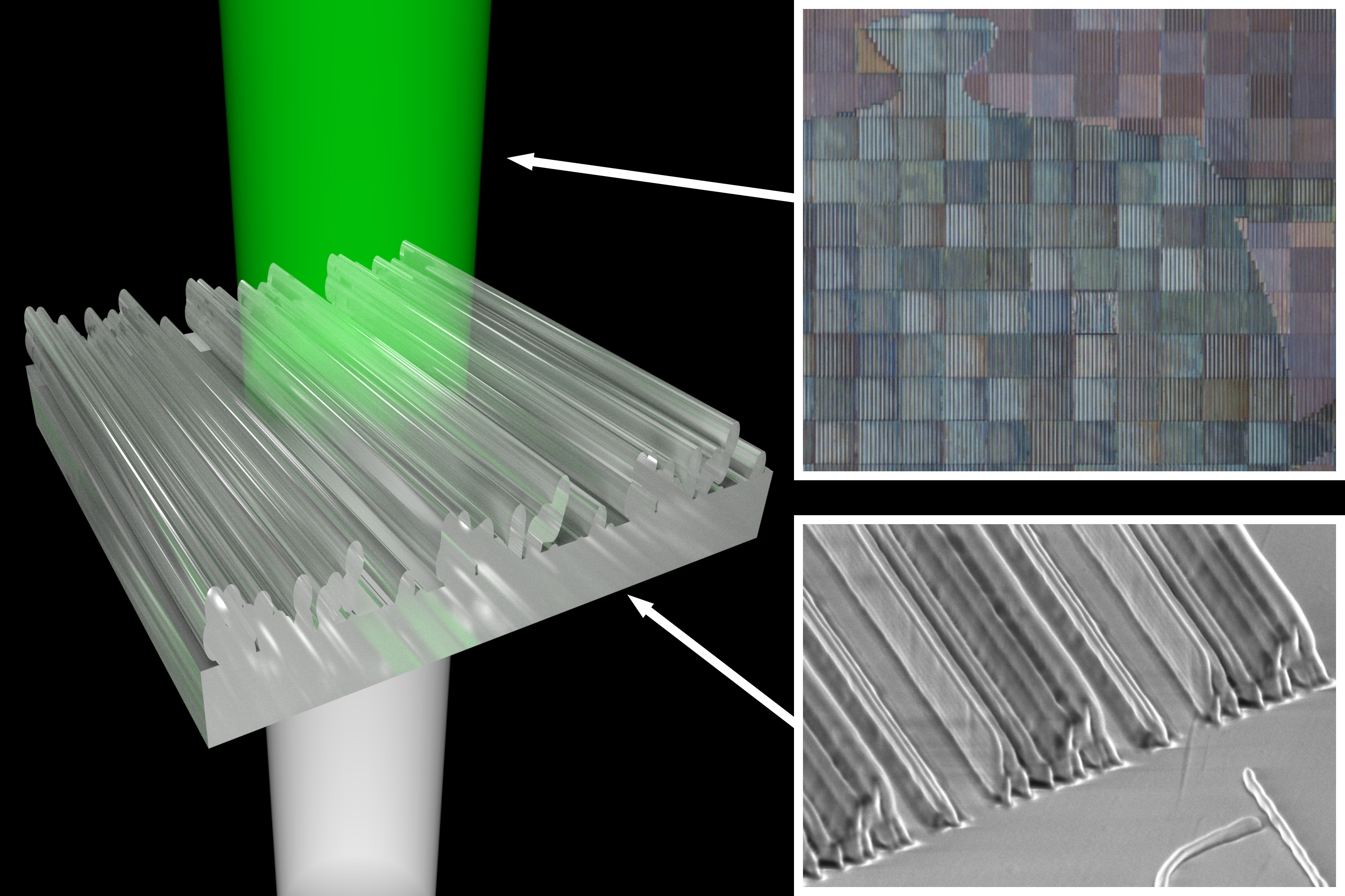
Caption: Light hits the 3-D printed nanostructures from below. After it is transmitted through, the viewer sees only green light — the remaining colors are redirected. Credit: Thomas Auzinger [downloaded from http://visualcomputing.ist.ac.at/publications/2018/StructCol/]
Most of the objects we see are colored by pigments, but using pigments has disadvantages: such colors can fade, industrial pigments are often toxic, and certain color effects are impossible to achieve. The natural world, however, also exhibits structural coloration, where the microstructure of an object causes various colors to appear. Peacock feathers, for instance, are pigmented brown, but — because of long hollows within the feathers — reflect the gorgeous, iridescent blues and greens we see and admire. Recent advances in technology have made it practical to fabricate the kind of nanostructures that result in structural coloration, and computer scientists from the Institute of Science and Technology Austria (IST Austria) and the King Abdullah University of Science and Technology (KAUST) have now created a computational tool that automatically creates 3D-print templates for nanostructures that correspond to user-defined colors. Their work demonstrates the great potential for structural coloring in industry, and opens up possibilities for non-experts to create their own designs. This project will be presented at this year’s top computer graphics conference, SIGGRAPH 2018, by first author and IST Austria postdoc Thomas Auzinger. This is one of five IST Austria presentations at the conference this year.
SIGGRAPH 2018, now ended, was mentioned in my Aug. 9, 2018 posting.but since this presentation is accompanied by a paper, it rates its own posting. For one more excuse, there’s my fascination with structural colour.
An August 17, 2018 Institute of Science and Technology Austria press release (also on EurekAlert), which originated the news item, delves into the work,
The changing colors of a chameleon and the iridescent blues and greens of the morpho butterfly, among many others in nature, are the result of structural coloration, where nanostructures cause interference effects in light, resulting in a variety of colors when viewed macroscopically. Structural coloration has certain advantages over coloring with pigments (where particular wavelengths are absorbed), but until recently, the limits of technology meant fabricating such nanostructures required highly specialized methods. New “direct laser writing” set-ups, however, cost about as much as a high-quality industrial 3D printer, and allow for printing at the scale of hundreds of nanometers (hundred to thousand time thinner than a human hair), opening up possibilities for scientists to experiment with structural coloration.
So far, scientists have primarily experimented with nanostructures that they had observed in nature, or with simple, regular nanostructural designs (e.g. row after row of pillars). Thomas Auzinger and Bernd Bickel of IST Austria, together with Wolfgang Heidrich of KAUST, however, took an innovative new approach that differs in several key ways. First, they solve the inverse design task: the user enters the color they want to replicate, and then the computer creates a nanostructure pattern that gives that color, rather than attempting to reproduce structures found in nature. Moreover, “our design tool is completely automatic,” says Thomas Auzinger. “No extra effort is required on the part of the user.”
Second, the nanostructures in the template do not follow a particular pattern or have a regular structure; they appear to be randomly composed—a radical break from previous methods, but one with many advantages. “When looking at the template produced by the computer I cannot tell by the structure alone, if I see a pattern for blue or red or green,” explains Auzinger. “But that means the computer is finding solutions that we, as humans, could not. This free-form structure is extremely powerful: it allows for greater flexibility and opens up possibilities for additional coloring effects.” For instance, their design tool can be used to print a square that appears red from one angle, and blue from another (known as directional coloring).
Finally, previous efforts have also stumbled when it came to actual fabrication: the designs were often impossible to print. The new design tool, however, guarantees that the user will end up with a printable template, which makes it extremely useful for the future development of structural coloration in industry. “The design tool can be used to prototype new colors and other tools, as well as to find interesting structures that could be produced industrially,” adds Auzinger. Initial tests of the design tool have already yielded successful results. “It’s amazing to see something composed entirely of clear materials appear colored, simply because of structures invisible to the human eye,” says Bernd Bickel, professor at IST Austria, “we’re eager to experiment with additional materials, to expand the range of effects we can achieve.”
“It’s particularly exciting to witness the growing role of computational tools in fabrication,” concludes Auzinger, “and even more exciting to see the expansion of ‘computer graphics’ to encompass physical as well as virtual images.”
Here’s a link to and a citation for the paper,
Computational Design of Nanostructural Color for Additive Manufacturing by Thomas Auzinger, Wolfgang Heidrich, and Bernd Bickel. ACM Trans. Graph. 37, 4, Article 159 (August 2018). 16 pages. doi.org/10.1145/3197517.3201376
This appears to be open access.
There is also a project page bearing the same title as the paper, Computational Design of Nanostructural Color for Additive Manufacturing.


![Cobalt Blue Tarantula [downloaded from http://www.tarantulaguide.com/tarantula-pictures/cobalt-blue-tarantula-4/]](http://www.frogheart.ca/wp-content/uploads/2016/10/CobaltBlueTarantula.jpg)
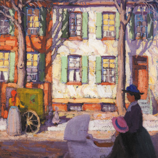
!["Autumn Harbour" [downloaded from http://metronews.ca/news/vancouver/1051693/chemists-in-vancouver-to-use-lasers-to-verify-group-of-seven-painting/]](http://www.frogheart.ca/wp-content/uploads/2014/06/autumn-harbour.jpg)